Sing Your Heart Out
Jessica Kasinski Website design
Role: UX/UI Design, Researcher, Project Manager, Web and Graphic Designer
Client: Jessica Kasinski
Platform: Squarespace
Duration: January 2024-May 2024
Team Size: 1
Tools: Figma | Adobe Illustrator | Squarespace
What is this?
Jessica Kasinski is an opera singer with over 20 years of experience in need of a website to reflect her career and showcase her previous performances. Jessica has an extensive resume of her performances, unique roles, and education in music. She wants the website to reflect her professional accomplishments in a way that also expresses her personality.
Project Goals
Create a one-page website for Jessica with emphasis on her performances including videos, audio clips, an event calendar, and her resume. People interested in her career who can reach out to her is a must, whether through email or LinkedIn.
A predesign discussion was made to make sure that both Jessica and I understood what was wanted and needed on the page. She had a few examples of singers who were national, regional, and local and had pages where she chose what features she liked and what she didn't like, making the idea clear. After discussions of the site, I emailed a questionnaire, and project proposal to Jessica outlining her expectations, my role in the project, and a time estimate of the project outcome.
Website Screenshots
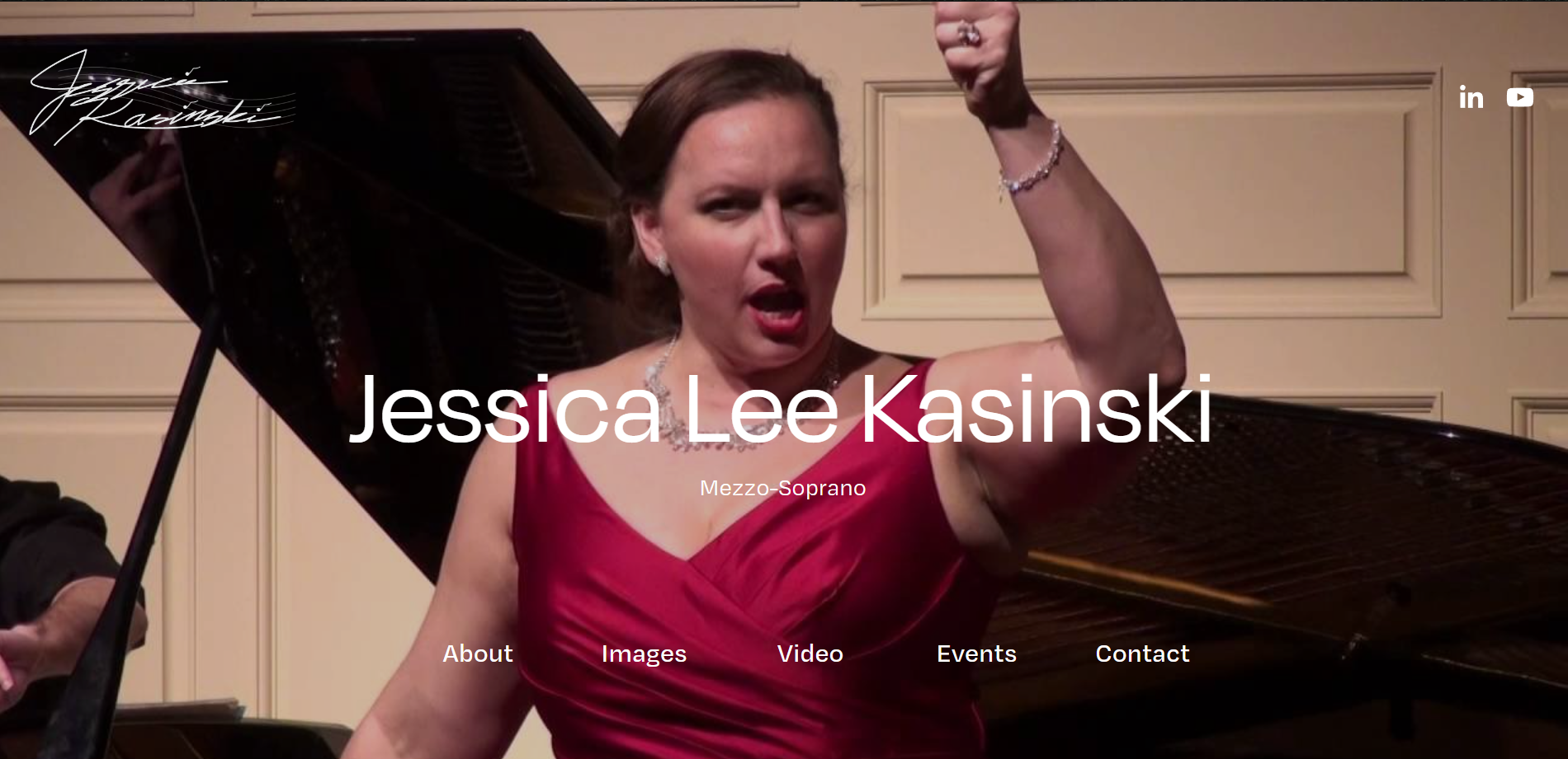
Header
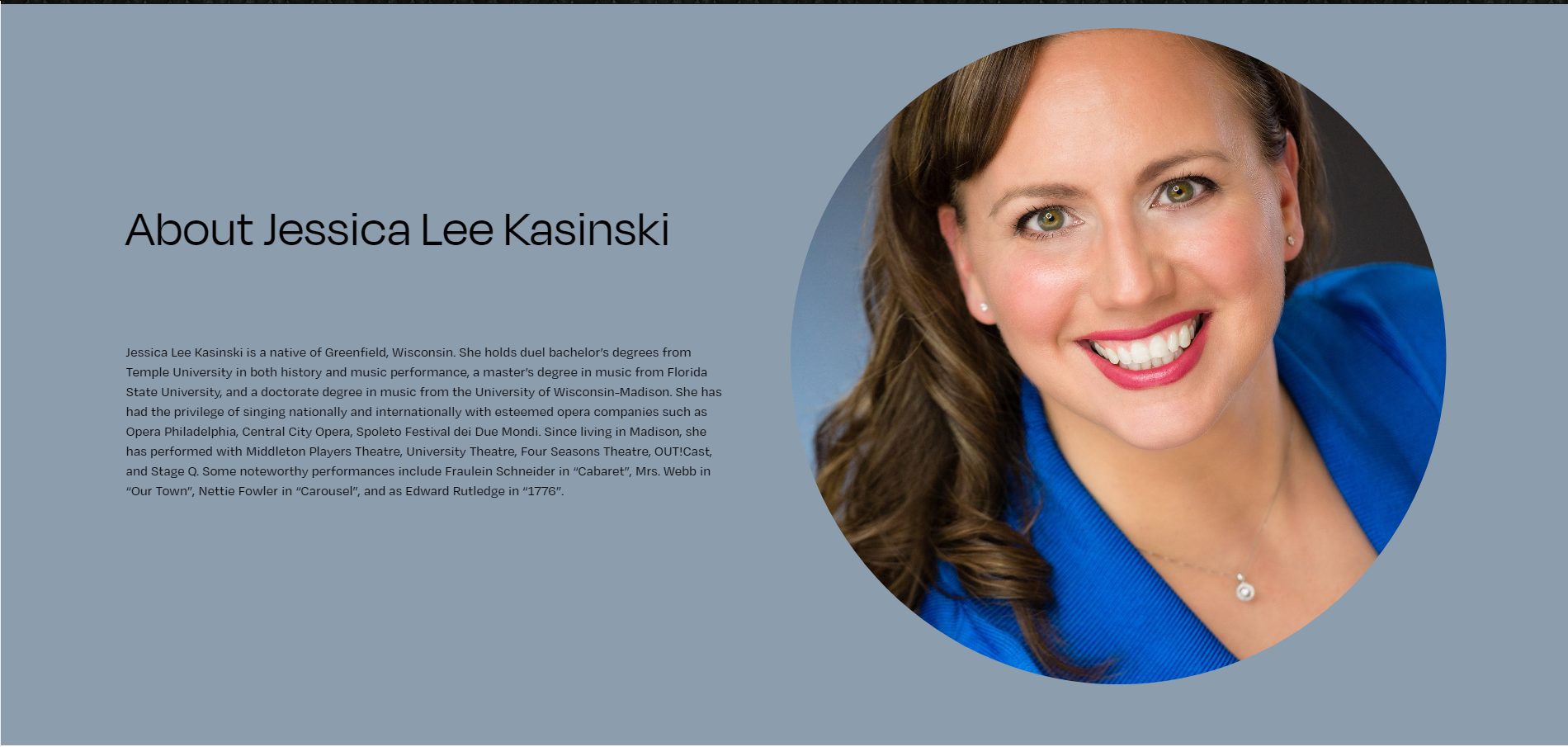
About
Images
Videos
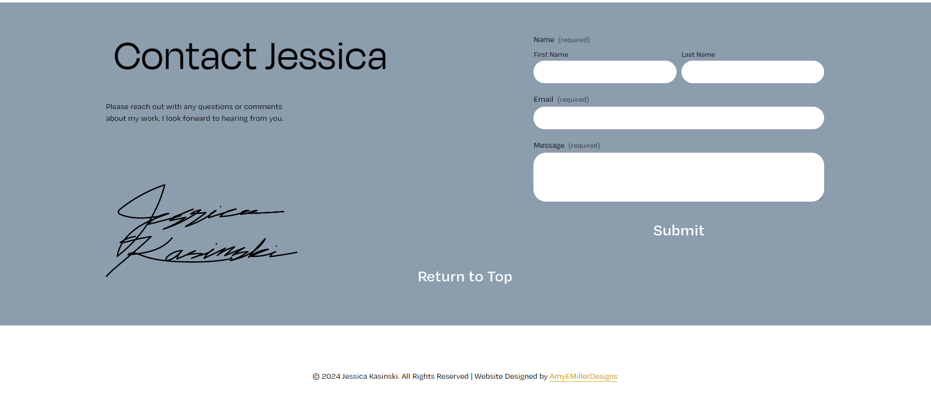
Contact and Footer
UX/ui Documentation
Lean UX documentation was done to expedite the process of a user flow redesign. It has simple personas, a style guide, a user flow, a site map and wireframes. All of this information was made to help someone who was not part of the design process understand my thought process of why I designed it the way I did and know the details of the design before they even see it.
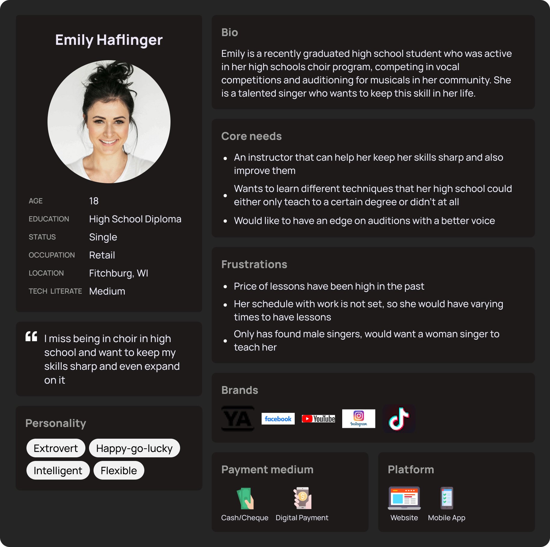
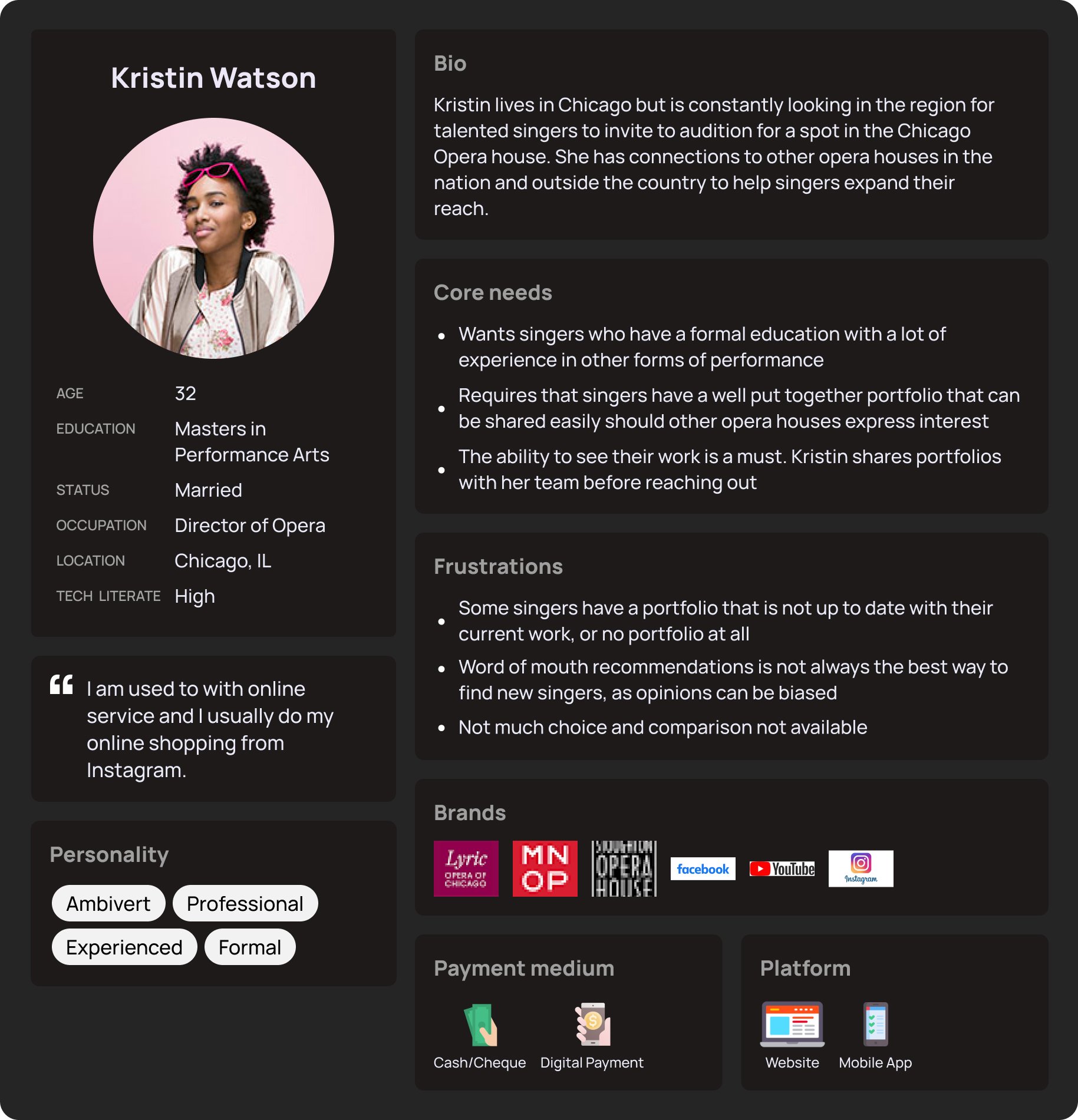
For Jessica's site, I went with a Lean UX documentation style, for the sake of time and knowing that this site was not so big to necessitate a large-scale investigation. Personas were created for an understanding of who would be looking at the page and why they would be on the page. It gives me a chance to place myself in the user's shoes.
Site Map
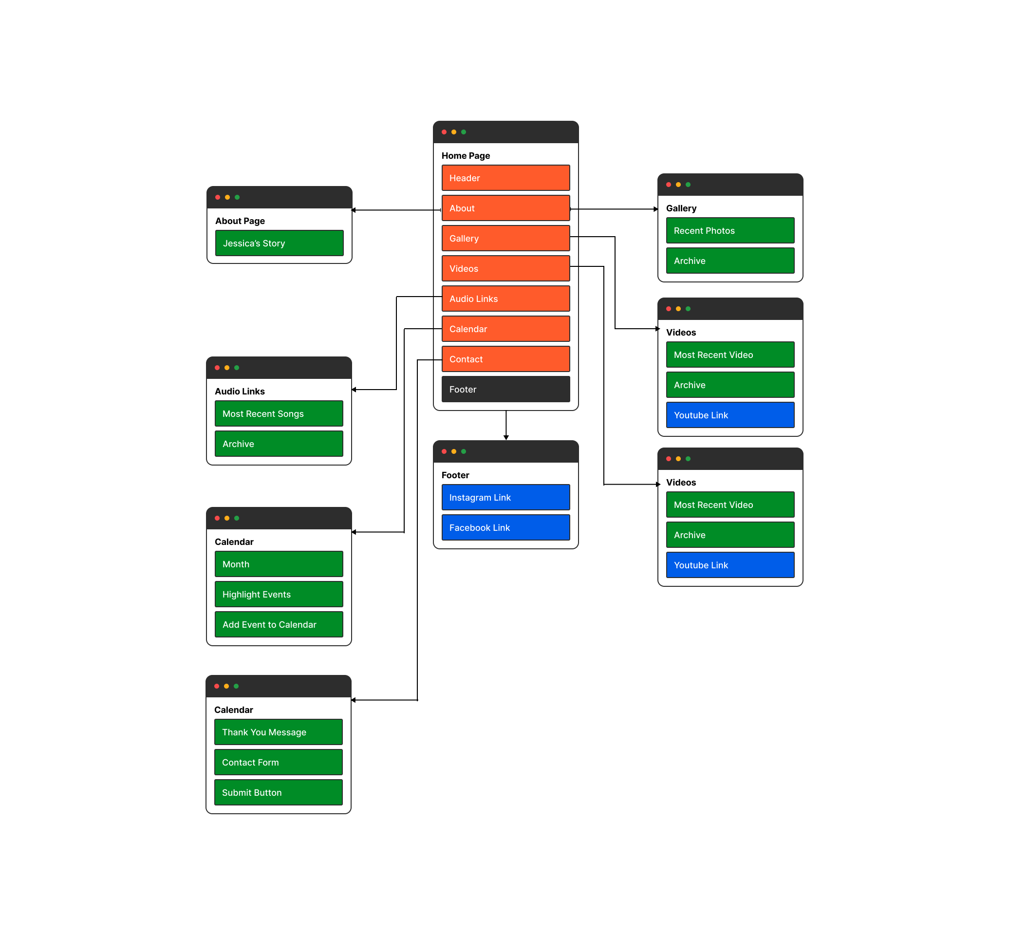
To further understand the users and how the site will look, I created a site map to look at and see if there was anything that I could have missed or could get rid of. As the site is only one page and need to have a lot of information, I wanted the page to not feel too overwhelming.
Wireframes
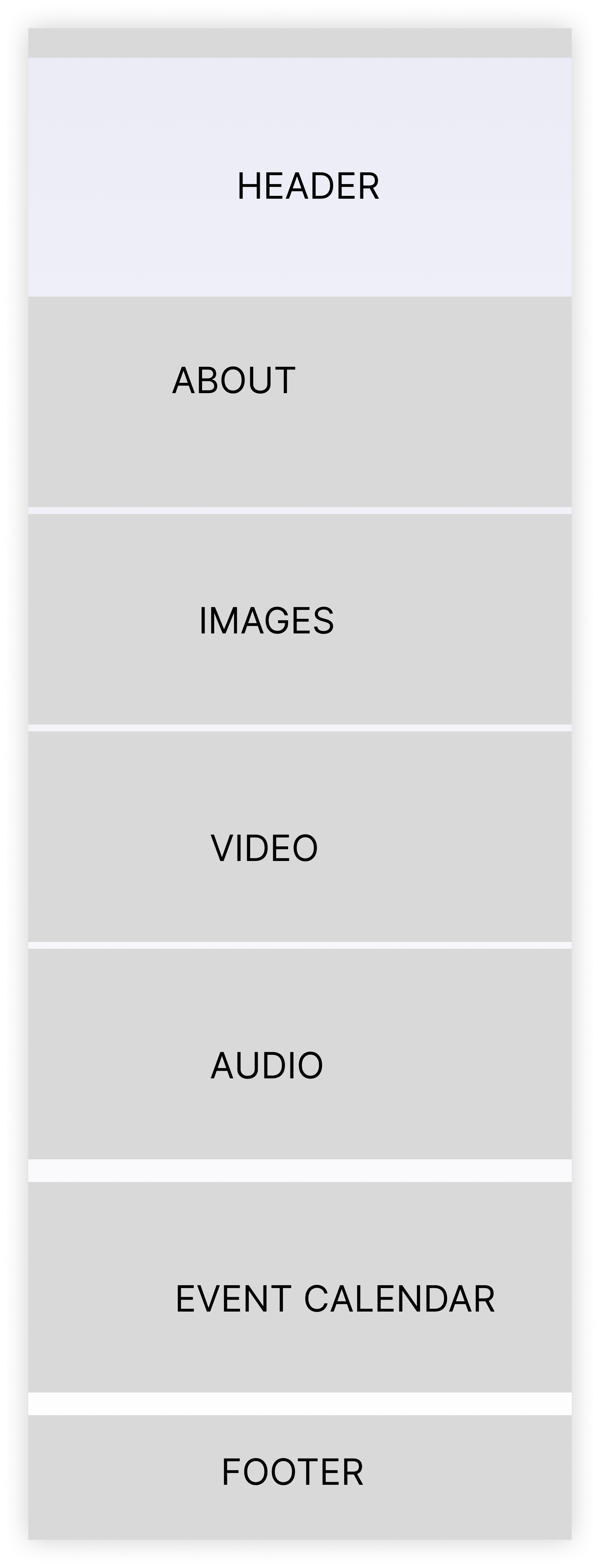
Wireframes for the site give myself and Jessica a general idea of what the layout of the page would be. As it was only one page long, it was more deciding on what should do where and in what order they needed to be. From order of importance it was decided that the about information section was going to be the highlight. After the wireframe was approved and completed it was decided to remove the section for the audio clips for Jessica to add later.
Website Design
After designs were approved, the website was built on Squarespace. This platform was chosen for Jessica based on it’s simpler interface and cost effectiveness. Screenshots of the website are also included in the gallery in case the site were to go down.
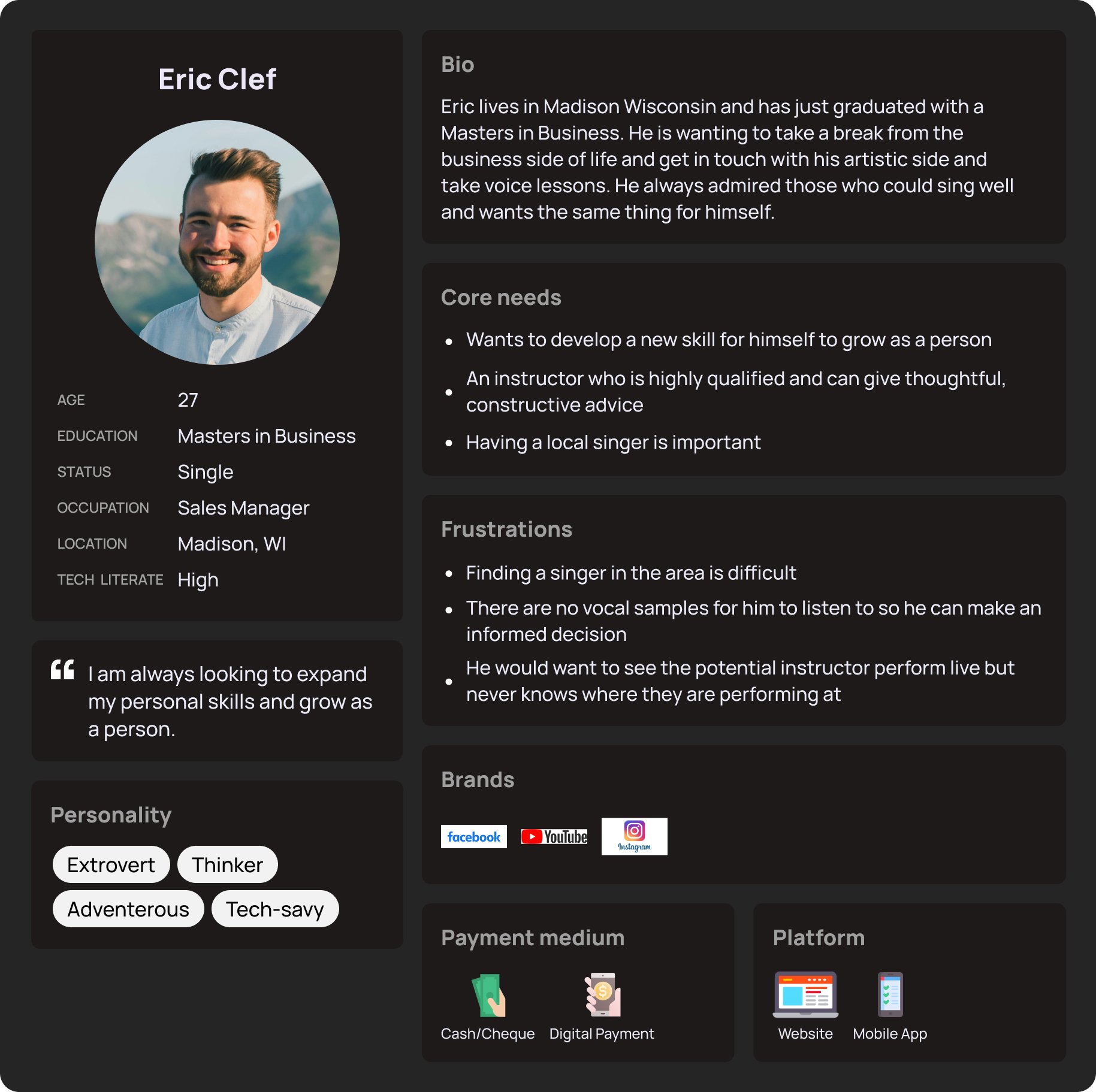
Persona Eric
Persona Emily
Persona Kristen
Site Map
Wireframe for Site

Header

About
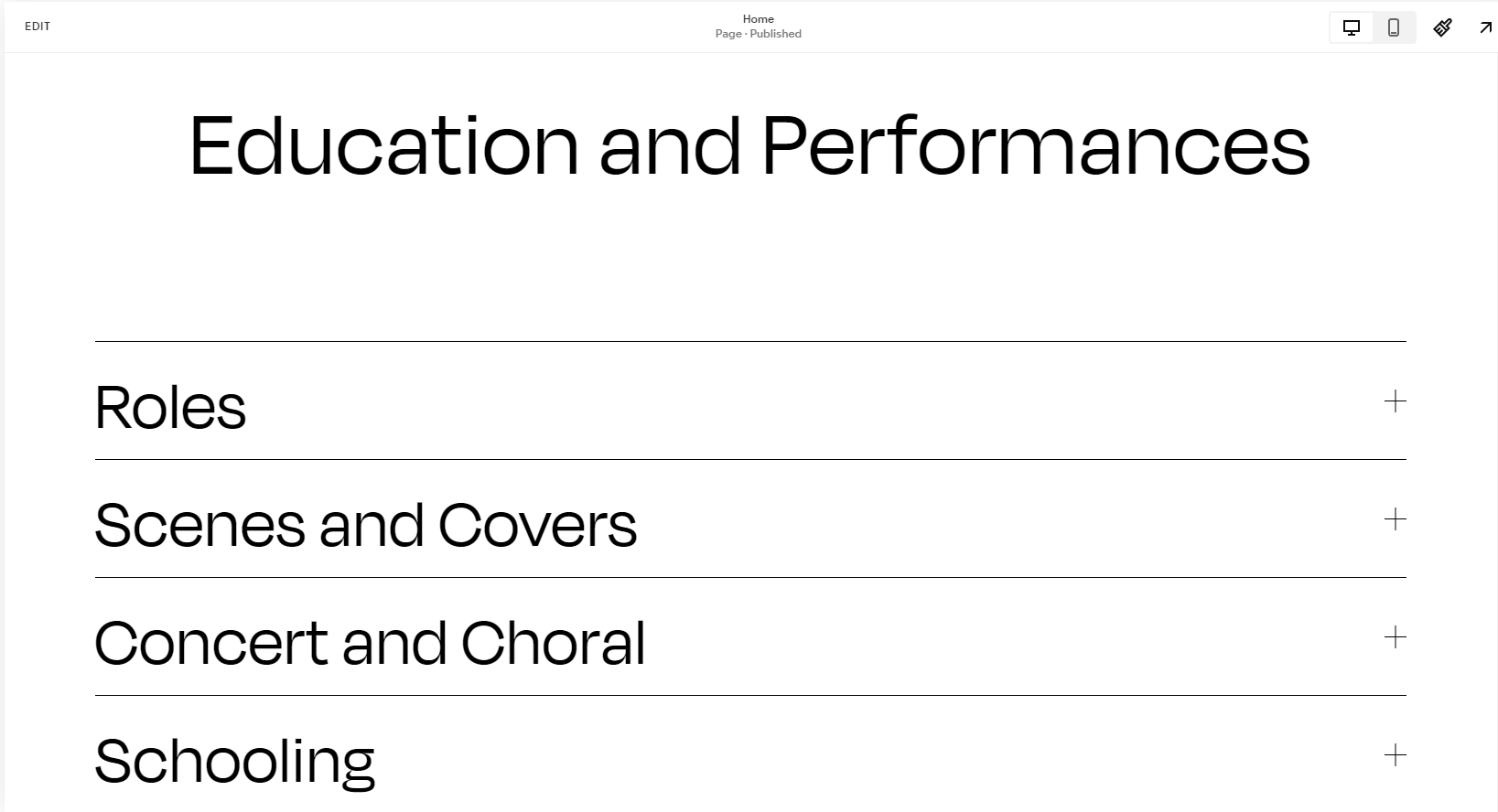
Education
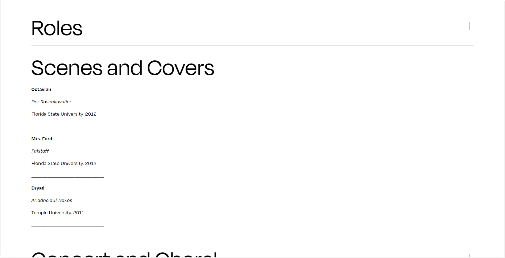
Education cont.
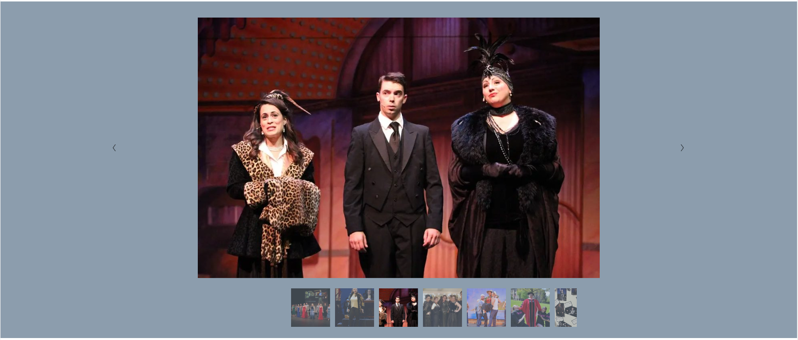
Images
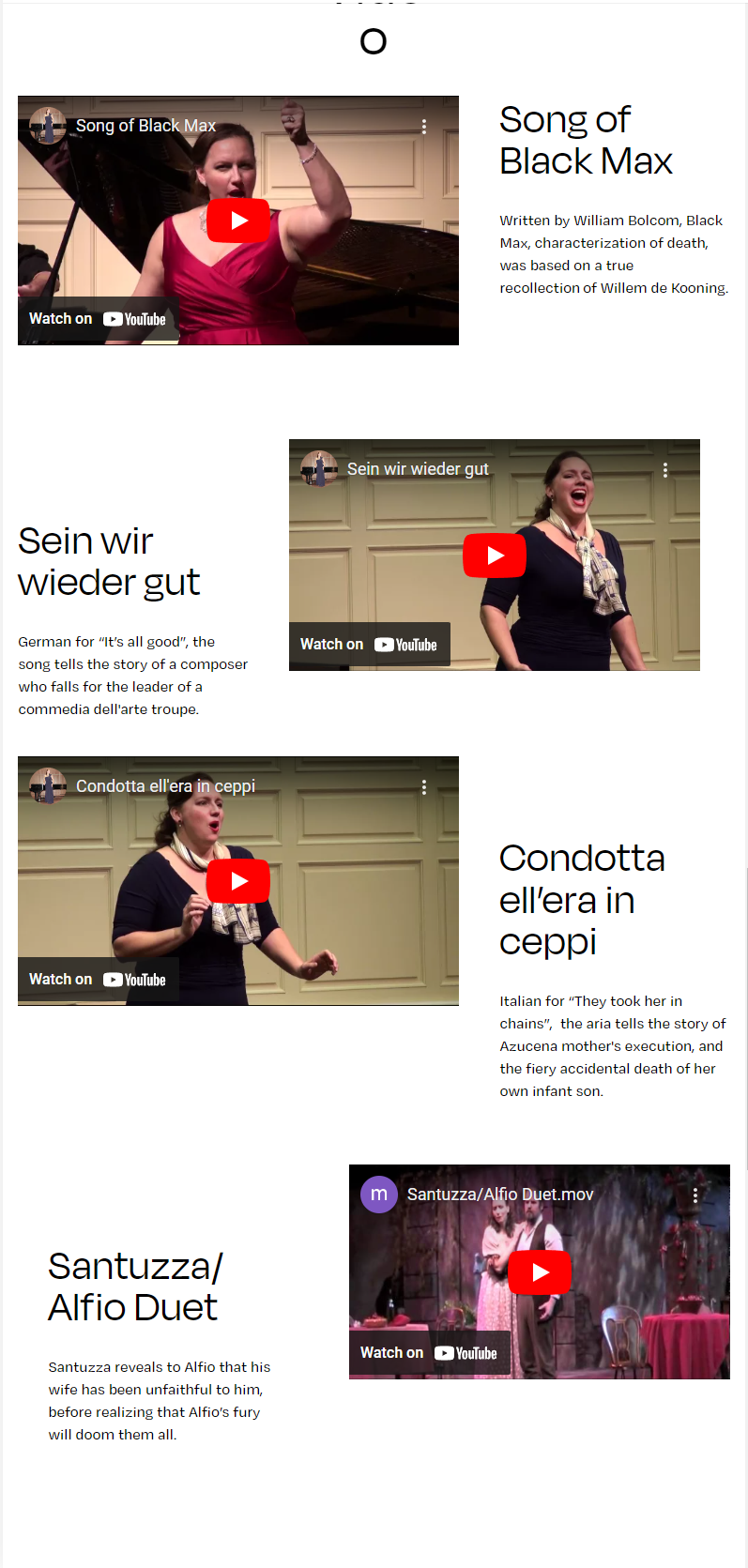
Videos
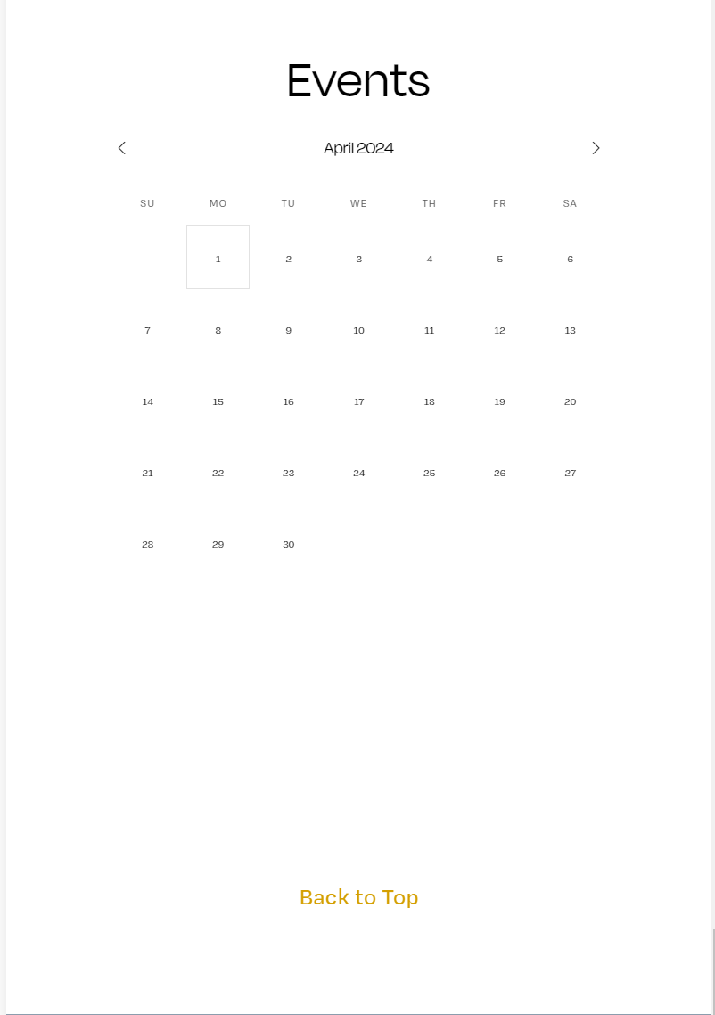
Calendar

Contact
-
Jessica expressed while building her webpage that she would only want it to be one page with anchor links. She wished to have a simple and condensed page while keeping it informative. Her page was designed using Squarespace, as the versatility and ease of use of the web builder was best suited for her. Along with building the webpage, she was also given a custom step-by-step walk through of how to do a few things that she will need to do in the future, as well as explaining a few of the features and what they are for. It is to benefit her in helping her understand her website better and for the possibility that there could be other designers she might reach out to for design help or to further her website.
-
Based on an estimation, I was able to conclude the following for time:
Building the Contract: 1 hr, 15 min. = $43.75
Creative Strategy Brief: 1 hr, 15 min. = $43.75
UX/UI Research: 4 hr = $140
Wireframing: 2 hr = $70
Working on the Site: 32 hr = $840
Meetings with the Client: 4 hr = $140
Creating the Walkthrough: 6 hr = $210
Total Cost: $1,487.50
The amount that it totaled out to was a bit higher than I originally predicted by almost $300. This is at a rate of $35 an hour.
-
The client has been looking for a website for herself for years. I feel some unique challenges came with building the site. The obstacle to overcome was surprisingly, a bit of communication. I felt that because we both felt that being related allowed for a more relaxed relationship, being as we see each other as sisters more than designer and client, some communication was left to the wayside from both sides. While this was not a persistent issue, there were a few times were we both needed to communicate needs and had to wait on the other at times. The other communication side was the fact that we had the freedom to message each other whenever some important details got a bit mixed in with regular family related messages.
Overall, I do not mind that I built a site for a family member and was glad that I was able to bring her vision to fruition. If there is a future time when I do create a site for a friend or family member, there will need to be discussion that anything related to the project only be discussed via email, so there is no missed messages and all things related to the project are kept in one place and not mixed in with other things.


