Discover Nature
“Parker”
App Design
Role: UX Design and Research
Client: Self
Duration: September 2022-December 2022, March 2024-April 2024
Team Size: 1
Tools: Figma, Adobe Photoshop, Adobe Illustrator
what is it?
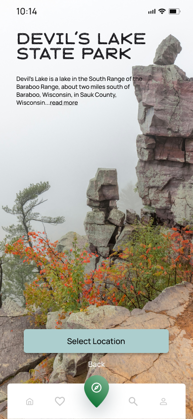
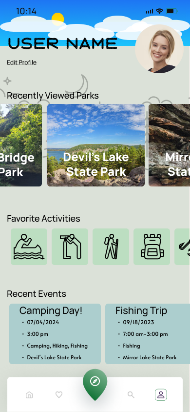
Parker is an app that is aimed to help the user find a park, explore the available amenities within that park, create camping reservations and put together events to invite friends to. It is meant to provide essential information in one place so users can explore state and national parks near them and feel informed going there, as well as enjoy their time more.
Summary
-
When someone visits a new area or wants to become more acquainted with the area they are in, one of the best ways to do it is to visit the state and national parks in the area. However, if the user has a difficult time finding any information about the park, they might be discouraged from visiting. For anyone wanting to discover state and national parks for their own interests or for a healthy outdoor activity for their families, there is always the small step to finding a park that fits the needs and wants of the person searching or just finding a park at all.
-
Parker aims to bring all the information to one place for everyone to access. Parker is designed with the outdoor enthusiast in mind. Whether it is to help circumvent the challenges of navigating a camping reservation or finding basic information about the park of interest, Parker is there to help the user discover nature. Parker is an app that will bring people who are interested in state and national parks to visit more often and allow all the amenities of what the parks can offer in one convenient location.
Design process table of contents
user research
My initial research for users was done with a survey form called, "State and National Park Survey for Active People". The survey was meant to discover what people are interested in when it comes to either exploring state and national parks as well as the amenities they offer. It was sent out on social media and targeted groups given 4 days to respond. At the end of the 4 days, there were a total of 9 responses. The data was put together in pie charts and a bar graph to quickly review it.
user personas and empathy map
-
The age range fell higher than I expected when I sent out the survey. It meant to me that, going into my design, I would need to think about keeping the design simple and easy to navigate to accommodate what I felt would be an audience that might not have much experience with complicated apps. The other surprise came when I saw the distance people were willing to travel to state parks if they found a high enough interest. It brought on the idea that the app could be used on a nationwide level, opening the prospect of more information needed to make the app reflect that.
-
The competitive analysis was completed looking at 5 different camping apps. Chimani, National Park Service, Just Ahead, REI Co-op Guide to National Parks, and Oh, Ranger! Park Finder. Having used and looked through the apps, there were several major pain points I was able to identify, in no particular order;
Feels crowded and busy
Color scheme felt weak
Extremely limited access unless paying for certain perks
National Parks available only; no option for state parks
No order to the parks listed, as in no "popular pick" or "nearest" option
App felt incomplete
Only available for iPhone
Listed city parks instead of state and national parks
One app had a pay feature
Can only use the app for a very specific reason (going to specific park)
There were positives for the apps as well that helped develop my design and planning for the app. It also gave me insight as to how a user would use the app;
Extremely interactive
Offers park highlights, such as monuments and other points of interest
A reward system
Can save parks and visits for later referencing
GPS features
Filter options for each park based on activity you wish to do
Very detailed park information, including hikes based on skill level and family friendly options
Up to date pictures of the parks
Clean, simple feel and look to some of the apps
Majority were free to download and use
-
The importance of this document is to write out what I already know (K), what I want to know (W), how I am going to find out what I need to know (H), and what I have learned after gathering everything I need (L). It also acts as a physical thought process for someone coming in and learning about the design process.
Know
Age range is 18 and older
Would be for people who are somewhat proficient in working an app on a phone
Distance from parks shouldn’t be an issue for most users
One designated app for all national and state parks would reduce confusion
Want to Know
What age group will this mostly affect?
Will this be good for families?
Could there be a way to incentivize new hikers to go to parks?
Would a feature for location based results be best or should it be search based only?
Should the app include national parks as a certainty?
How to Find
Join hiking groups online and ask questions
Questionnaires based on interest in outdoor activities would be the best start
Secondary research into information on state and national parks
Learned
What activites and expectations there would be for someone who is looking for something to do in a state park would want to find
The age range for those interested in the app is a bit higher than I anticipated, so the app itself should not be over complicated or flashy
Most people who are interested in the app already have knowledge of parks in their area
Interest in being able to make a reservation for activities that require equipment was not as high as campsite reservations
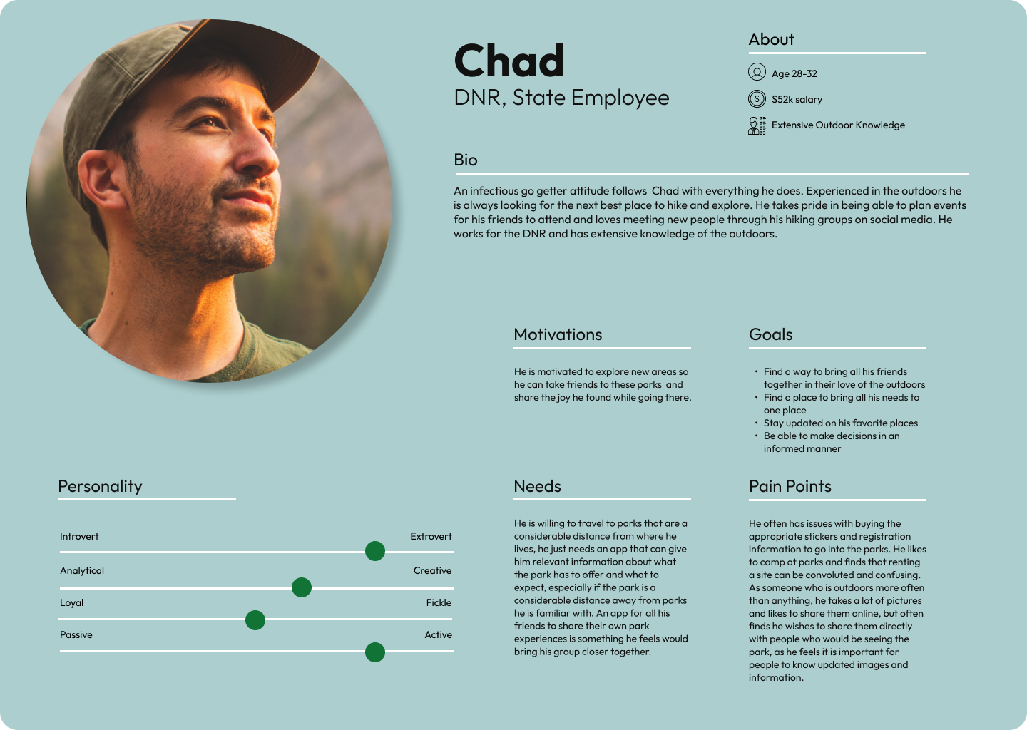
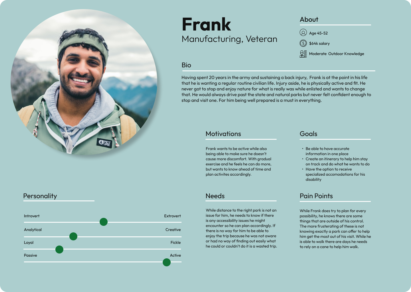
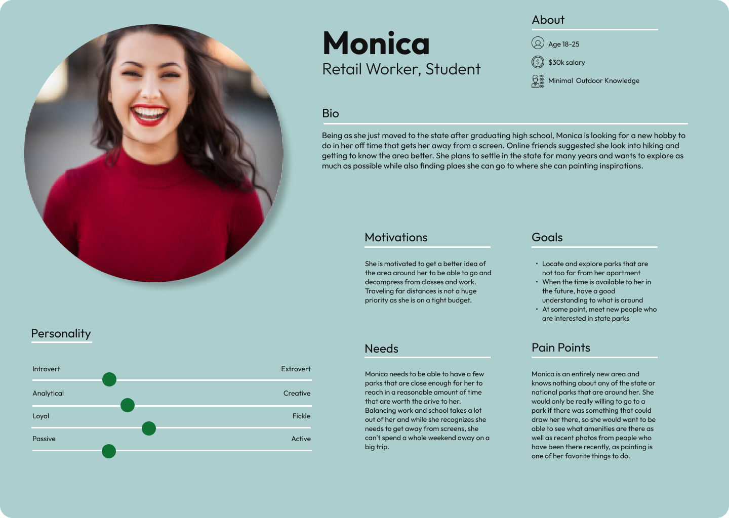
The user personas are based on the results from the surveys taken and sent back. They could be broken down into 3 different demographics based on age, family structures, and time spent outdoors. From there, the results could be defined further on age groups, marital status and whether there were families with children, and how much time was typically spent outside.
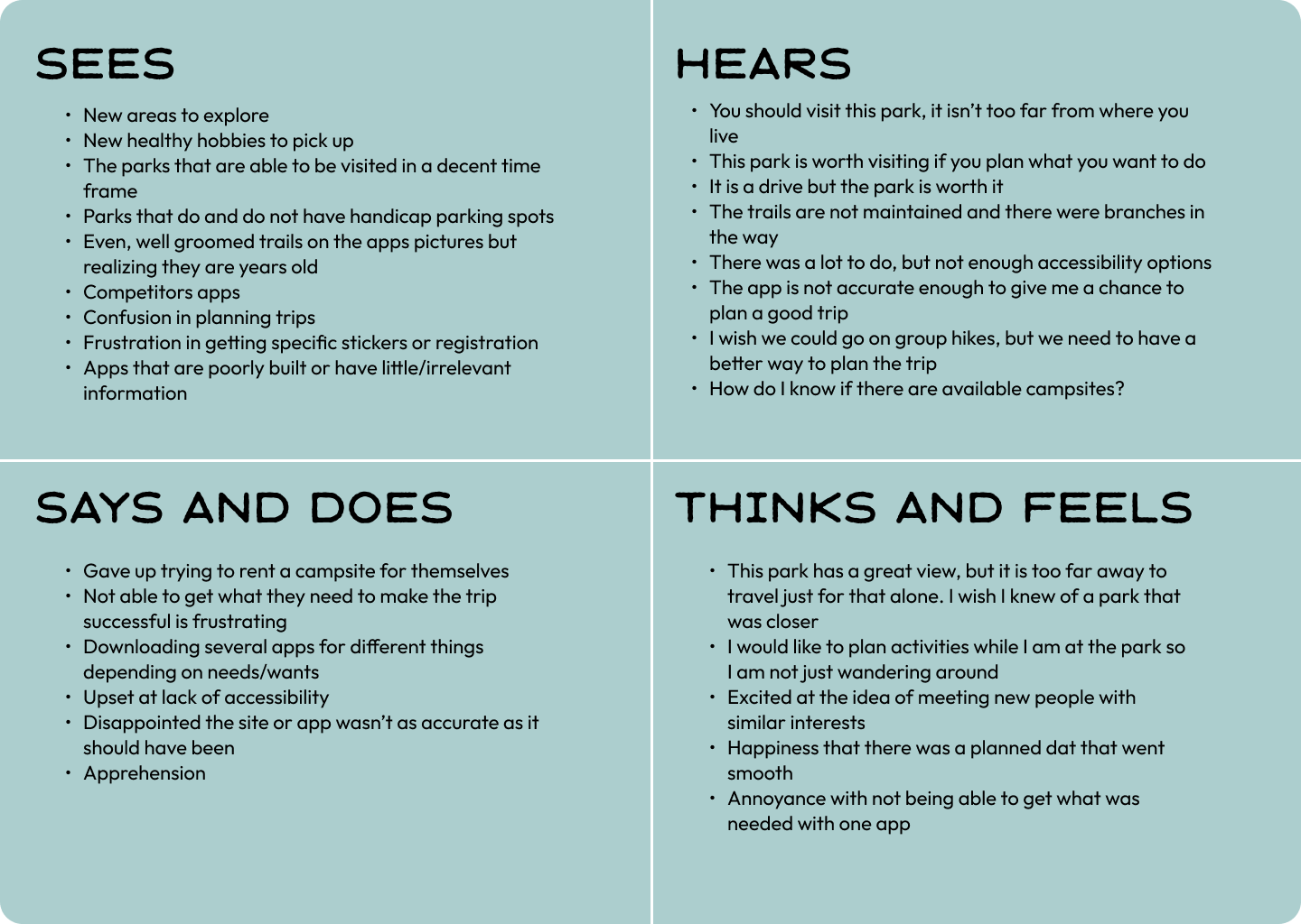
Empathy maps were a bit of a challenge to work through, as I had to delve further into what I thought the user would be thinking, feeling, seeing and hearing. I had to open my perspectives and think outside the box as much as I could. Combining all the personas in one map makes it a bit dense but I felt it was the best way to showcase the information.
M.v.P.
The M.V.P., or minimal viable product, is a process for creating a production-ready product based on collaboration with users that undergoes continuous iterations and improvements until a “final” product is created. It is a written wireframe of what the app would operate like with the thoughts of the user being present and the UI requirements for that thought to play out correctly in the app.
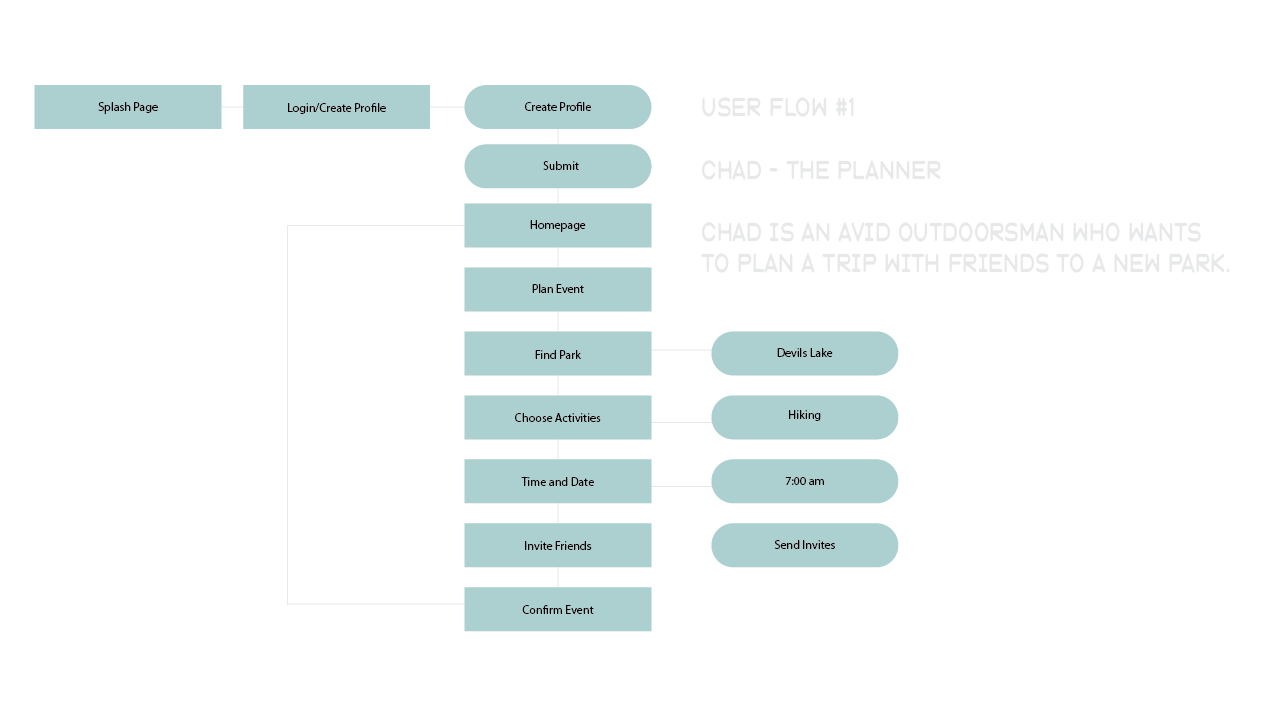
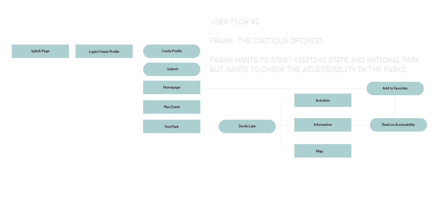
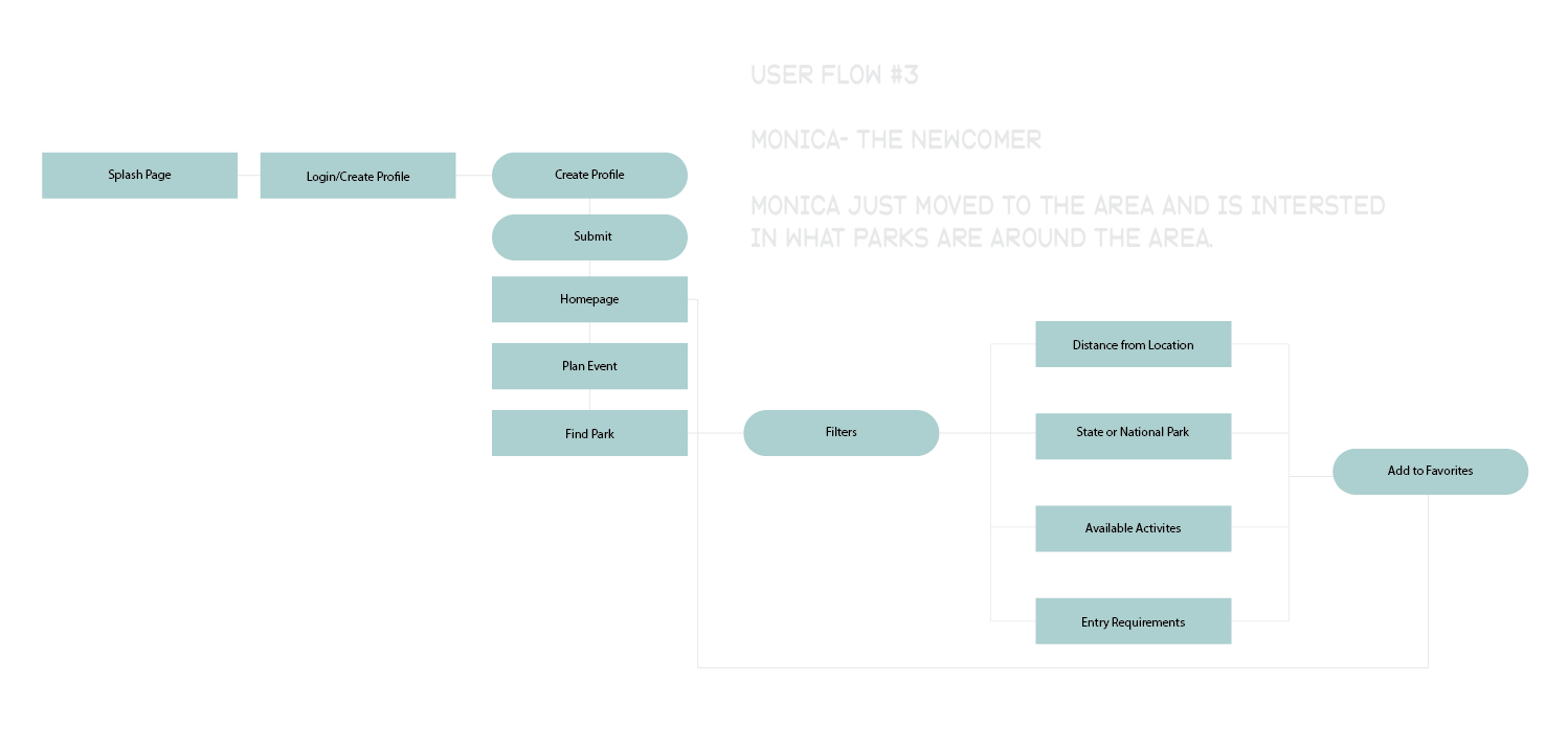
user flow
User flows are meant to show what an imagined use of an app could be based on each persona and how they would utilize it with the help of the MVP and the UI requirements. It is meant to show the unique thought process and how they might approach a specific task. The user flows were easy to imagine because it felt linear with no chance of “wandering off track” like most apps would have the temptation to do.
style guide
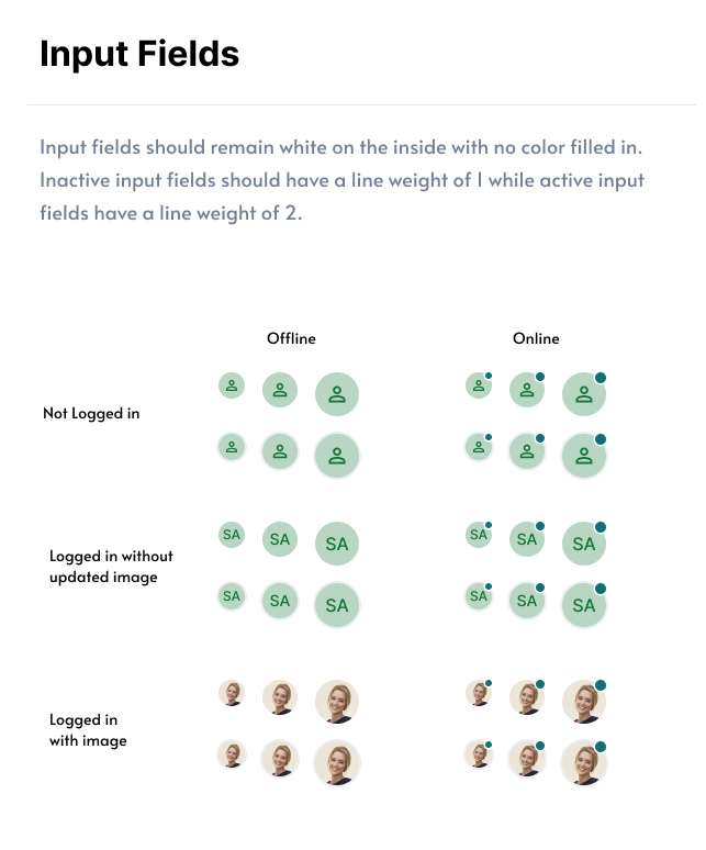
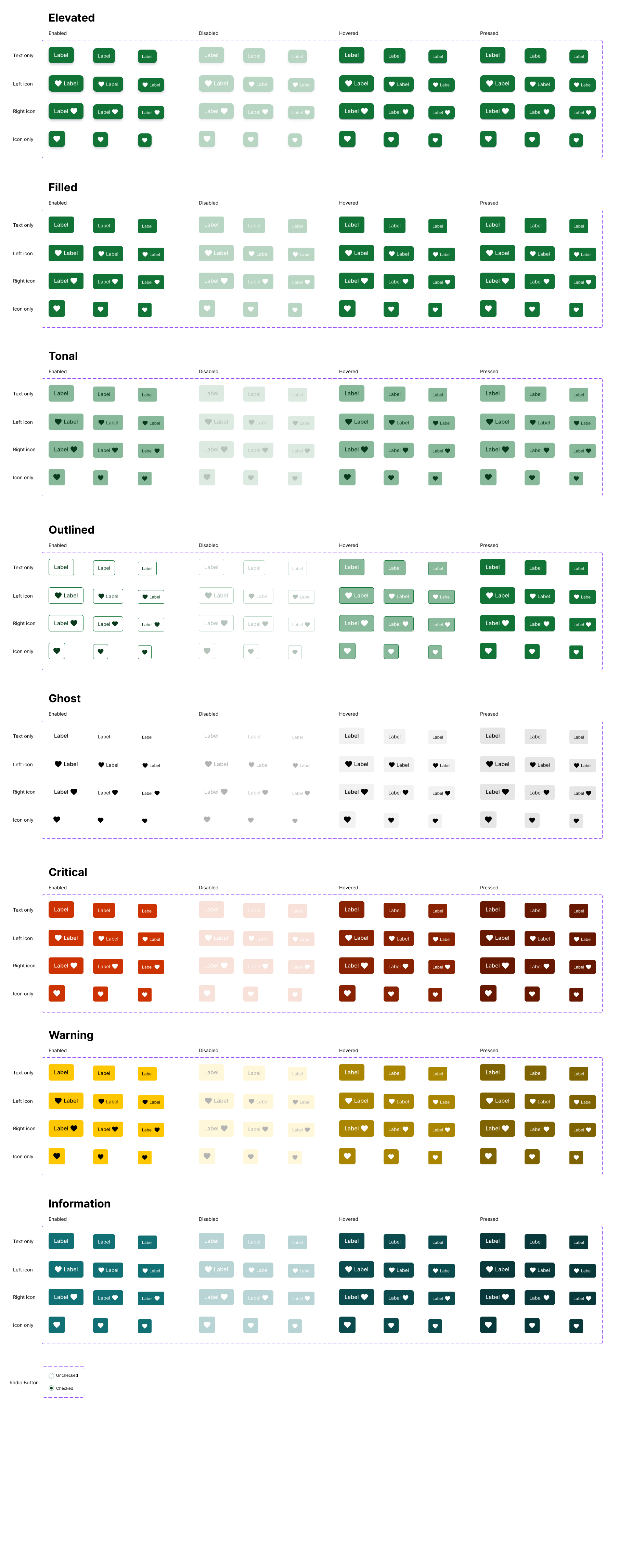
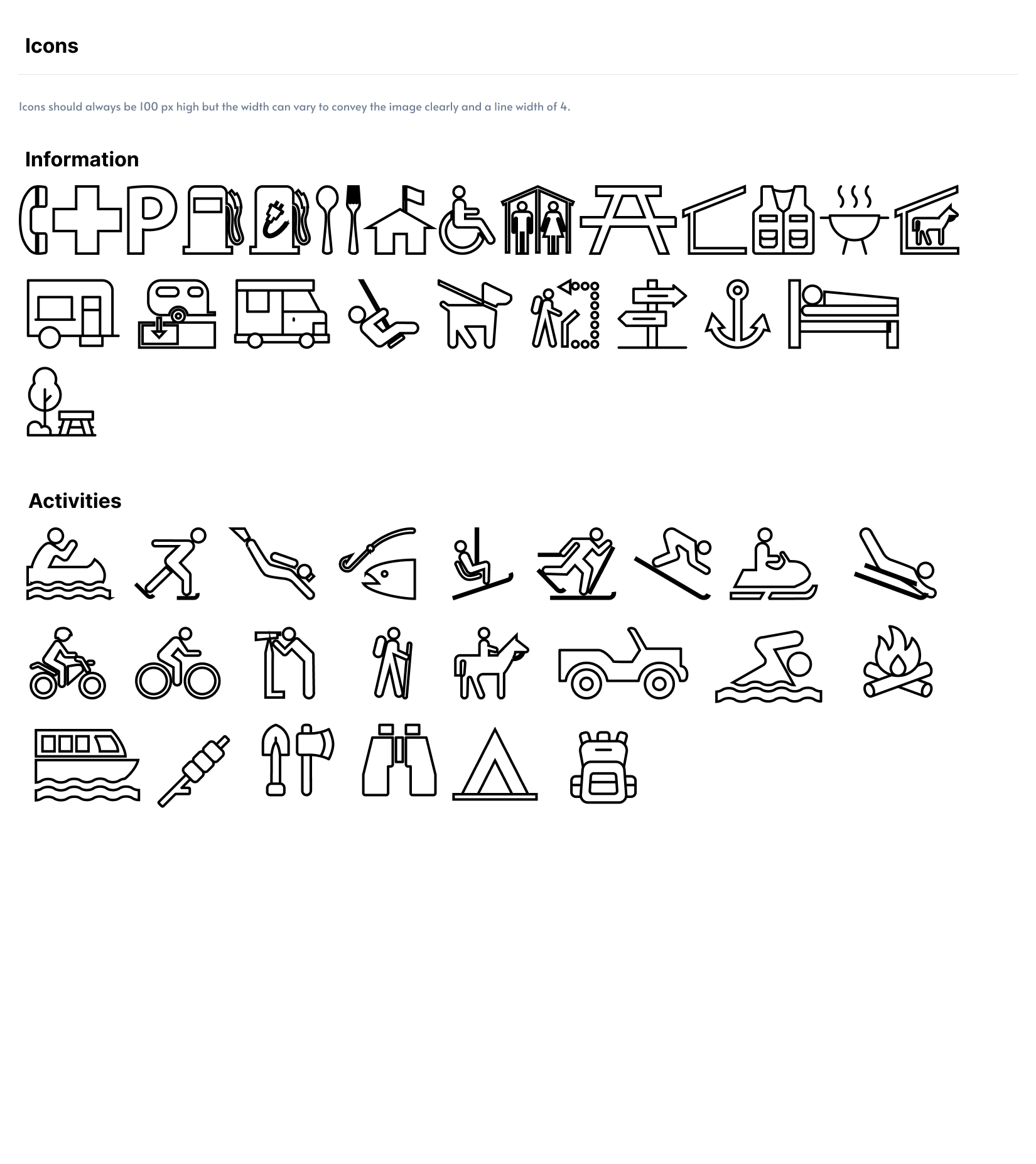
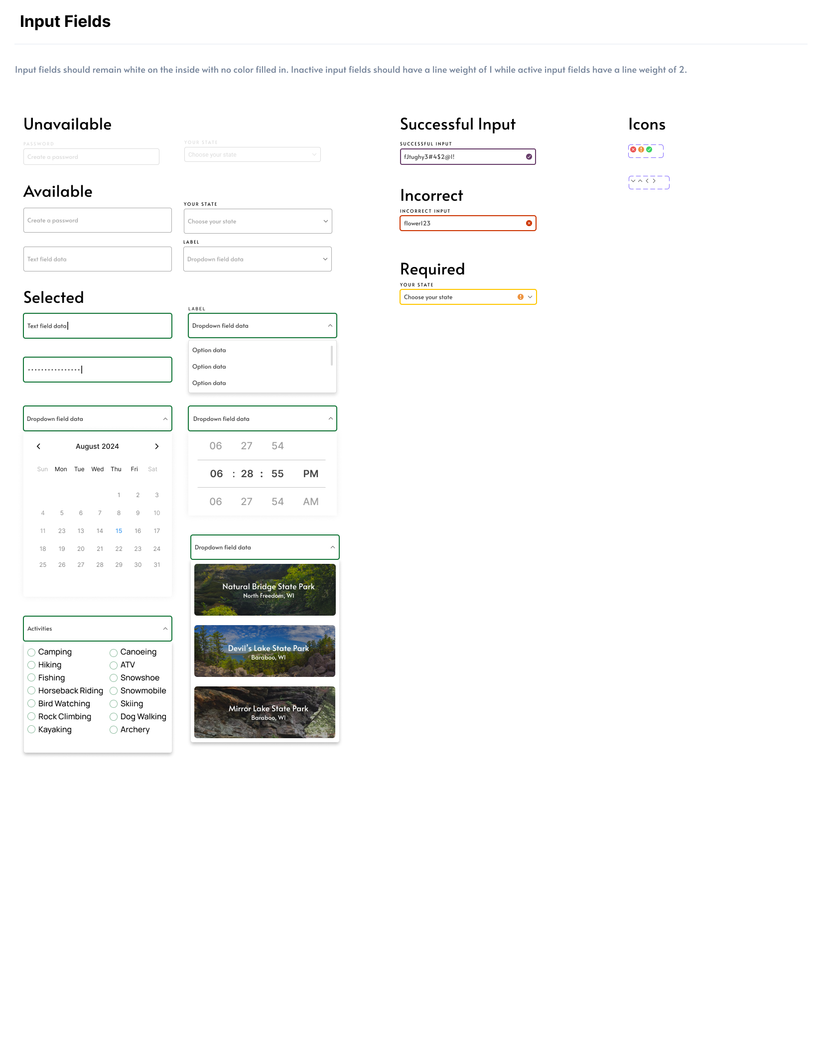
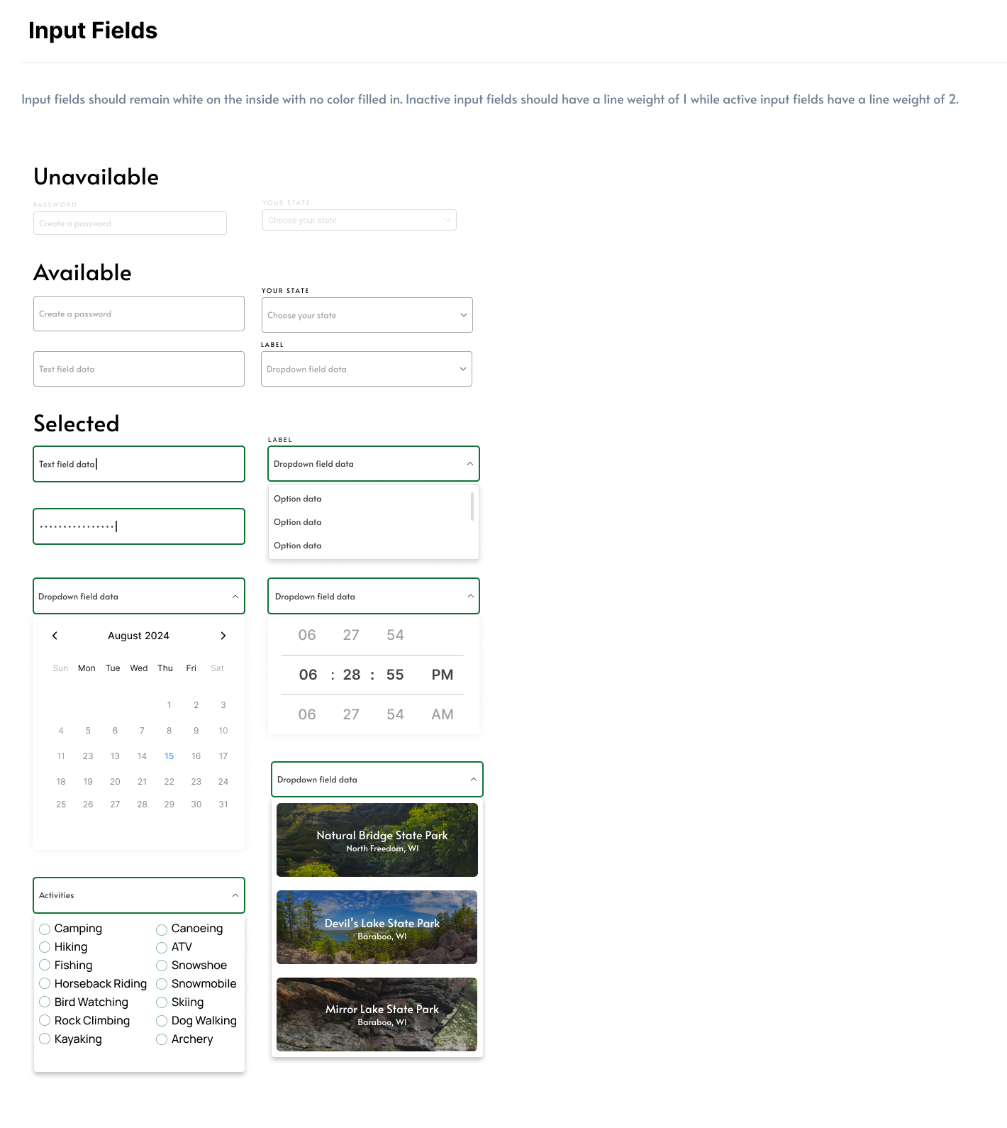
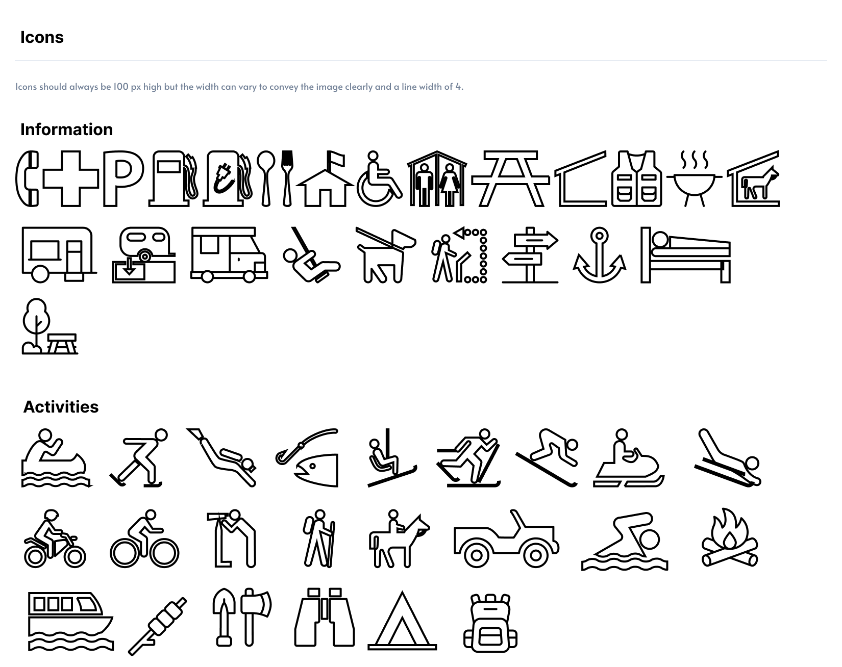
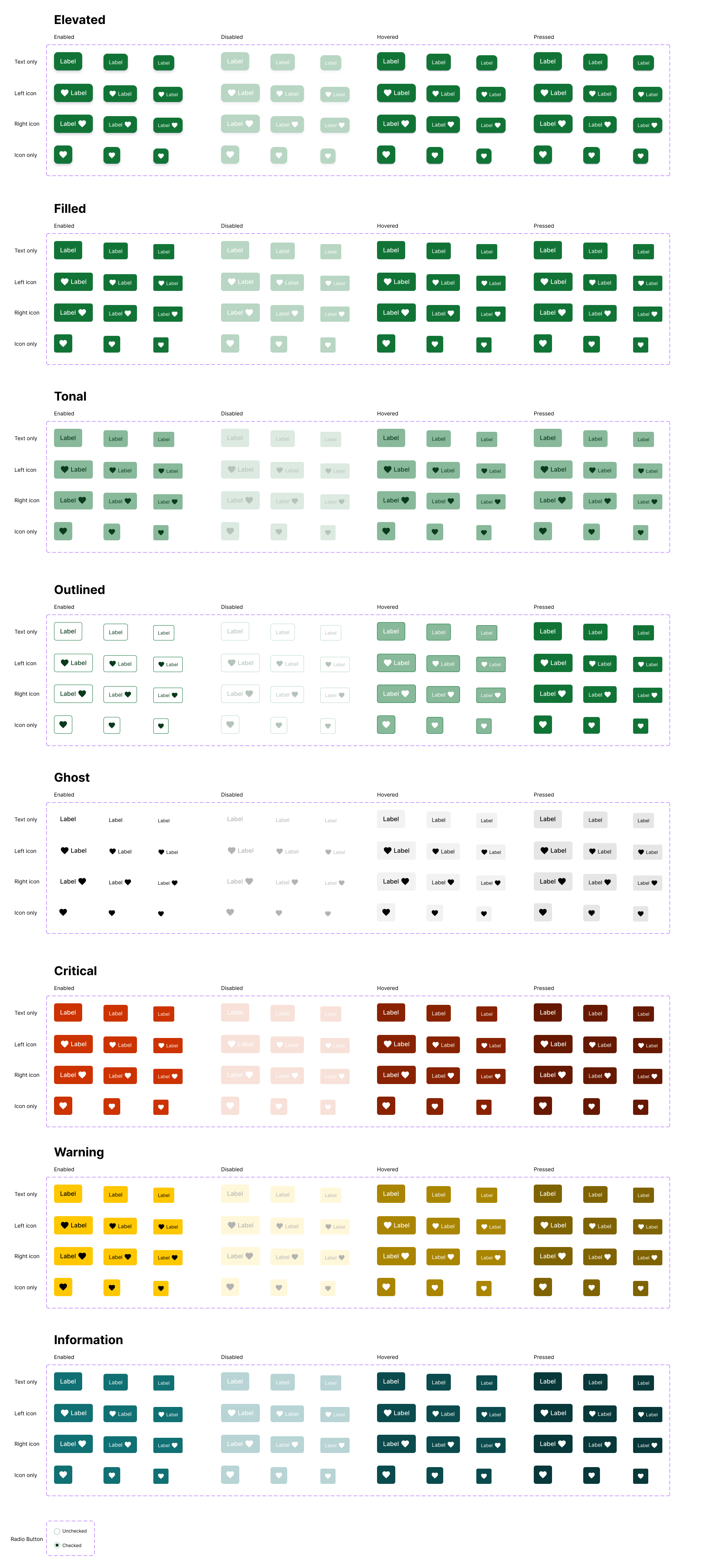
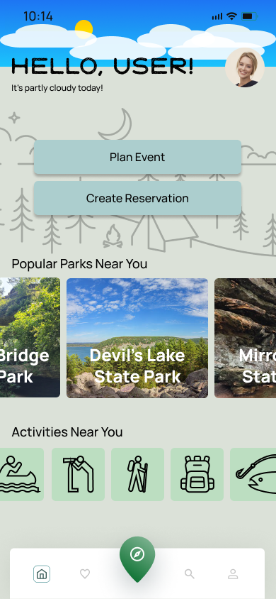
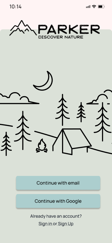
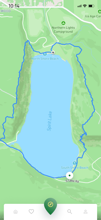
The colors, text, logo and button designs were all made to reflect what the Parker app would feel like to the user, going for an outdoorsy and modern feel.

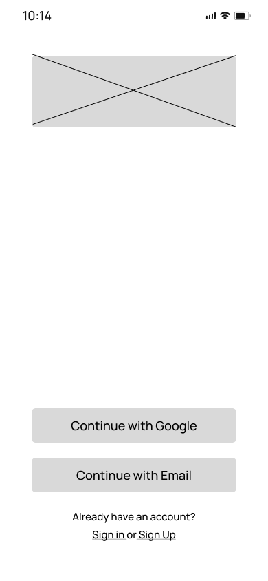
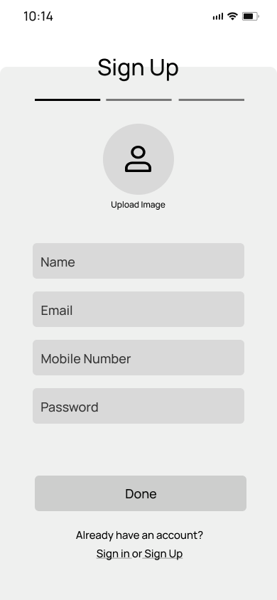
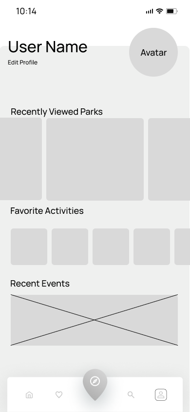
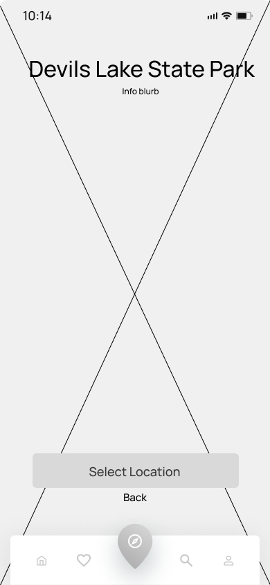
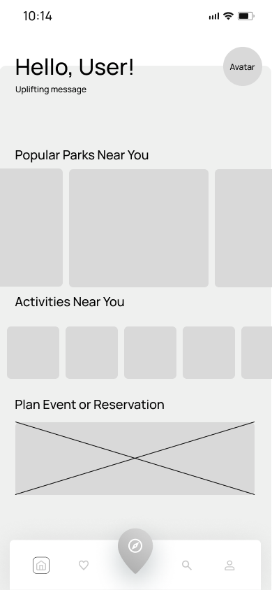
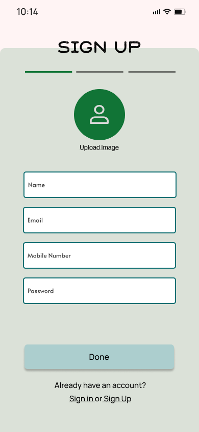
wireframes
Reflection and Final Thoughts
-
This being my first big app design, there was a lot of learning that I had to do along the way. Such a research heavy project was not my strong suit, but I did enjoy the design aspect of the project.
The amount of time doing the first design was much more than the second time coming back to it, but I felt the second time coming back to it was less stressful and much more productive.
I was quite exhausted from making the style guide for the redesign, as I realized just how much was missed in the first design. Taking a break from the whole project for a day was what I needed to recharge.
Being kind to myself was necessary. Looking at the design from where it started to where is was now was quite a humbling experience, but seeing the growth was a great feeling.
-
Learning to work with Figma in a way that cut down the number of screens was a great help. It reduced my work fatigue and makes the prototypes much more interactive for anyone wanting to test it.
Any feedback is not always good feedback. I can learn more from someone who gives me critical feedback than someone who is going to give me passive feedback.
From working on it previously, detailed and accurate research creates a lot of ideas, and not all of them need to be in the design. With the new design, there was a few ideas that were scrapped from the old one.
Space in the app design is ok. Not every square inch of the design needs to be used up by something.


