Feel the Power
MG&E Saas Rebuild
Role: UX Design and Research
Client: Self
Duration: January 2024-February 2024
Team Size: 1
Tools: UX/UI Design, Figma, Adobe Photoshop, Adobe Illustrator
What is this?
Serving the greater Madison, WI area and other parts of southern Wisconsin, MG&E has been providing electric and gas services and businesses for 100 years. It is the nations second most reliable electric providers, with customers experiencing one outage every two and a half years, as opposed to the national average of three outages every two and a half years.
SUmmary
-
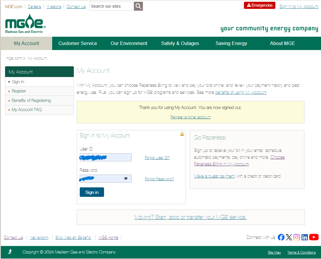
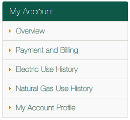
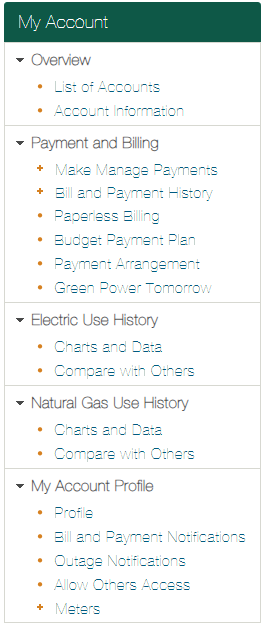
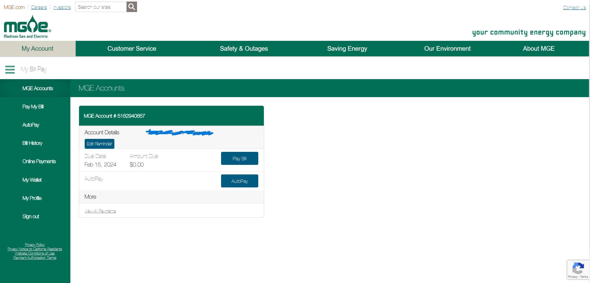
MG&E has an outdated, busy homepage for their customers. It feels overwhelming when you first go in with the amount of buttons on the account overview page, making deciding what do to overwhelming.
-
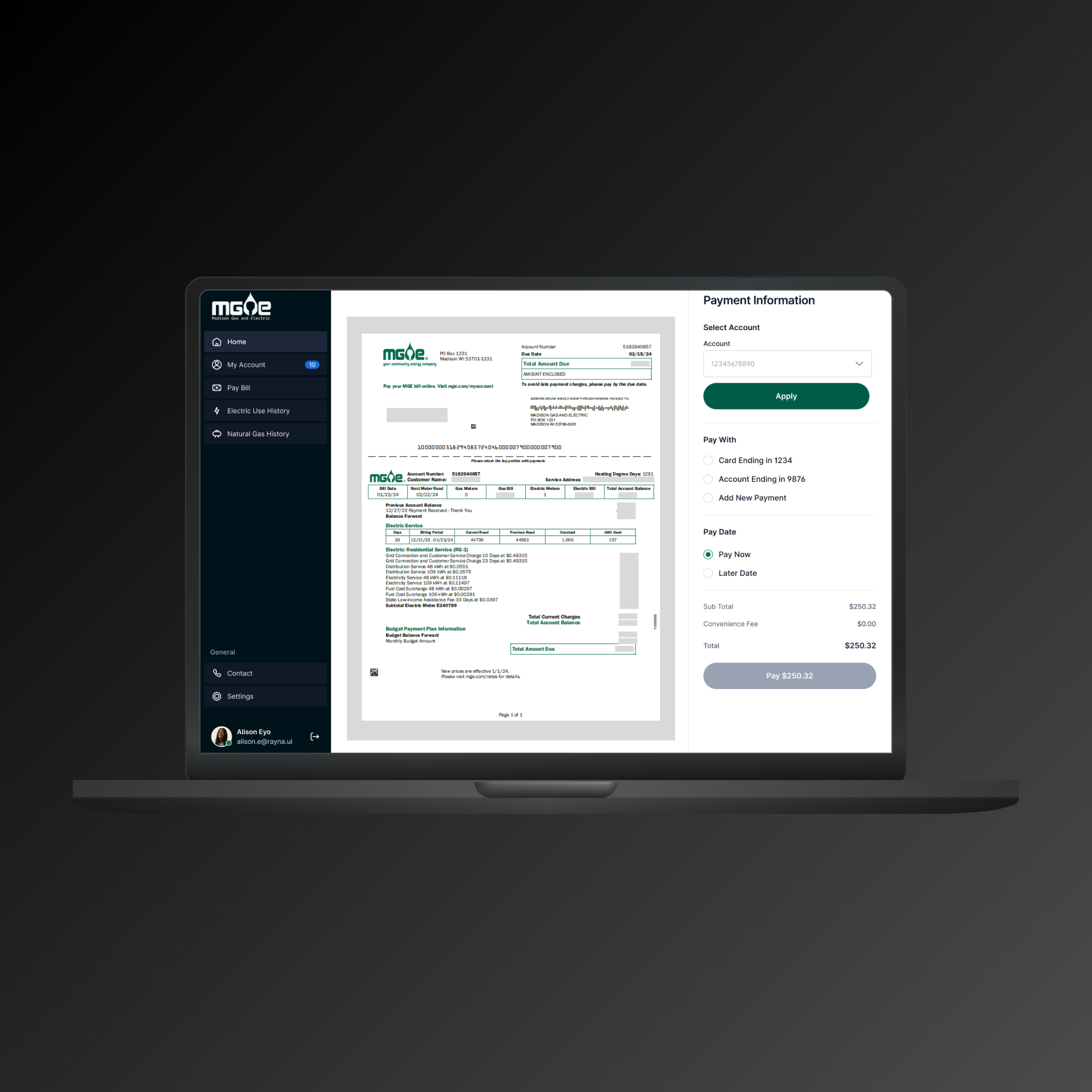
For the project, I will be focused on cleaning up and redesigning the payment experience a customer will have while on their profile in MG&E.
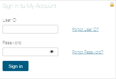
Previous UI
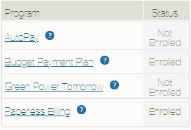
The design at the time of this rebuild lacked hierarchy, was very crowded, and had no clear sense of direction. With the payment portion of the experience, the multiple screens of the payment process can be excessive when it can be brought down to a single page for simplicity.
UX Documentation
Lean UX documentation was done to expedite the process of a user flow redesign. It has simple personas, a style guide, a user flow, a site map and wireframes. All of this information was made to help someone who was not part of the design process understand my thought process of why I designed it the way I did and know the details of the design before they even see it.
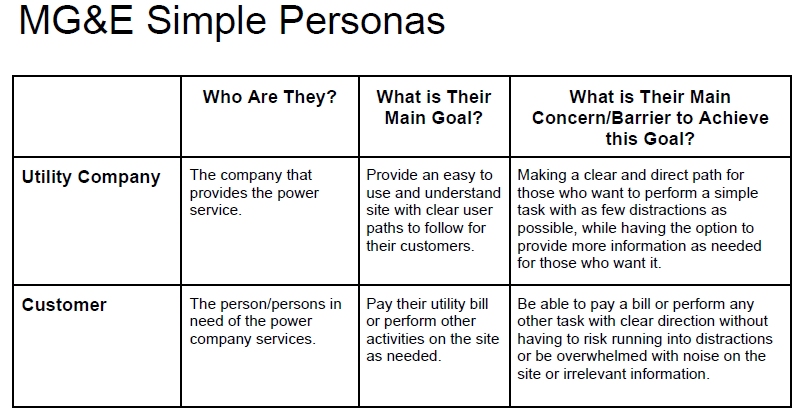
Simple Personas
These two lean personas are meant to indicate two people who would have a common goal from the redesign of MG&E. From the side of the customer and the side of the company providing the service, it was important to look at both sides of the user experience and understand their needs and wants. The design is based on a customer who wants to pay their bill.
Style Guide
MG&E had a strong branding by itself as far as colors, but icons and other designs were lacking. Some buttons had icons in them, nothing stood out as being more important than the other and different fonts in some of the buttons, as well as other elements, show the lack of consistent design choices. This style guide is meant to show uniform, brand colors and font choices for the redesign.
User flow and site map
This user flow is based on a customer's experience paying their bill and the predicted path they would take based on their options. The path shown is what a customer might do while they are paying their bill. It gives options based on the choices they will make and where they will lead.
Site maps gives the user an understanding of the site and the tabs the site would have. It was built in a way that is much easier to navigate and less crowded than the previous site.
Wireframes
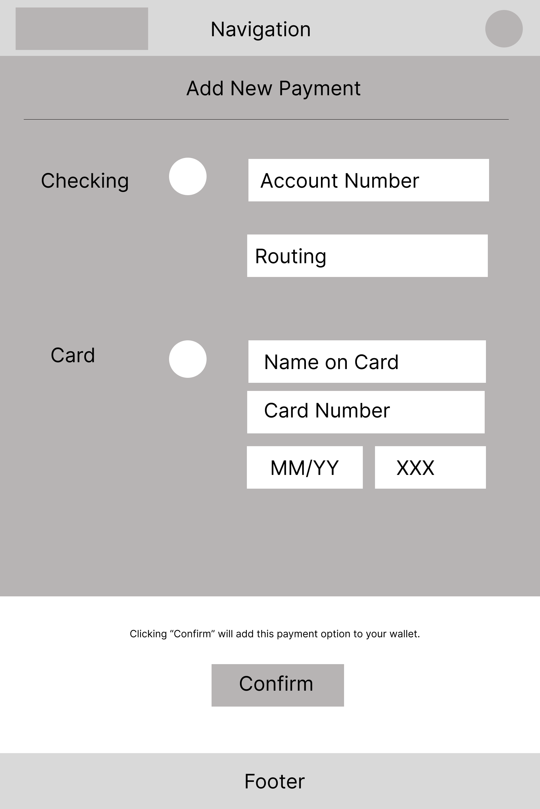
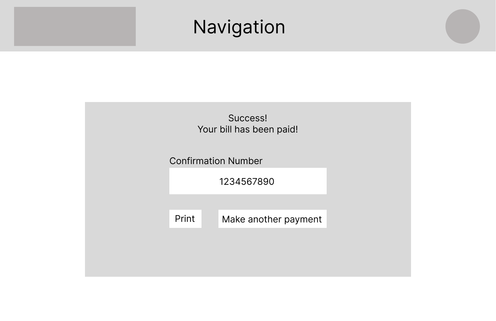
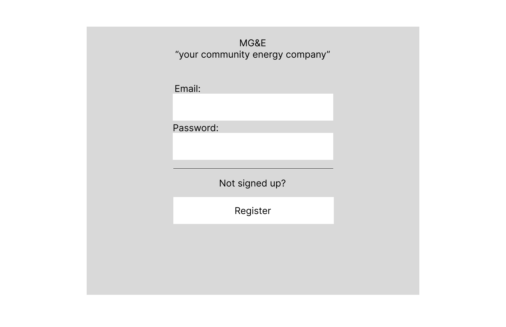
Wireframes of the site give a rough idea of what would be expected of the new site. It shows a simplified, less distracted way to show the basics of the site and how it will operate. These wireframes are not the final design but instead just a blueprint of the site and to map out the information that would be needed to create the high fidelity mock up.


Hi-fi Designs
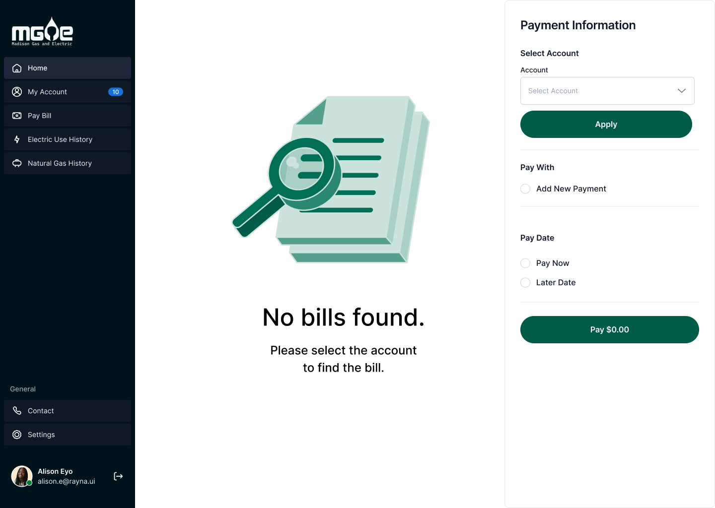
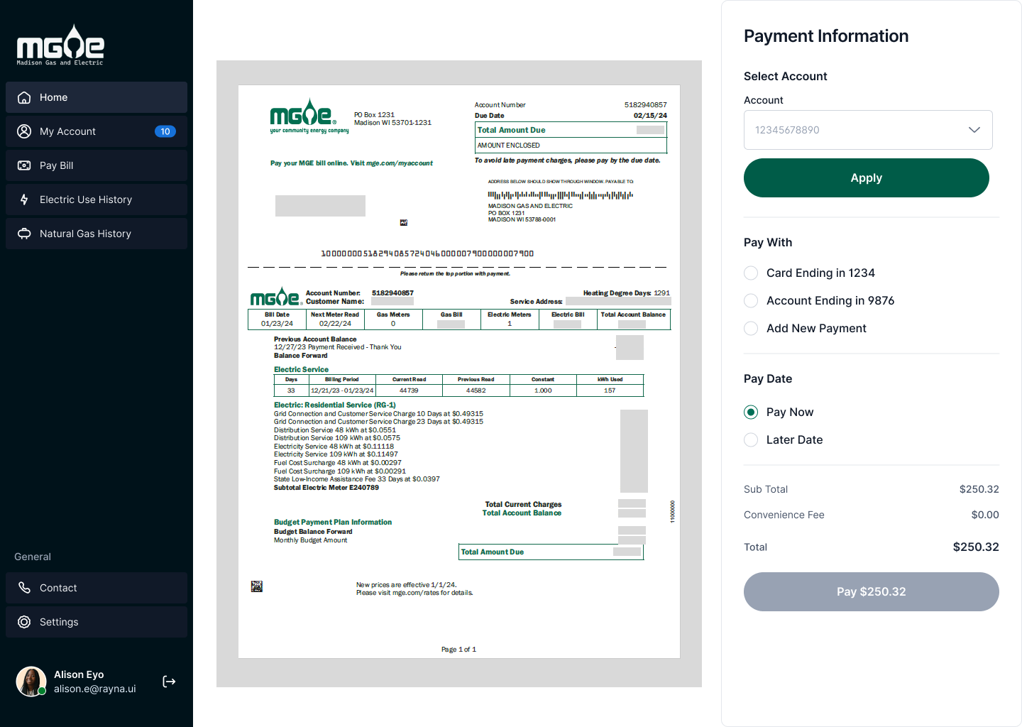
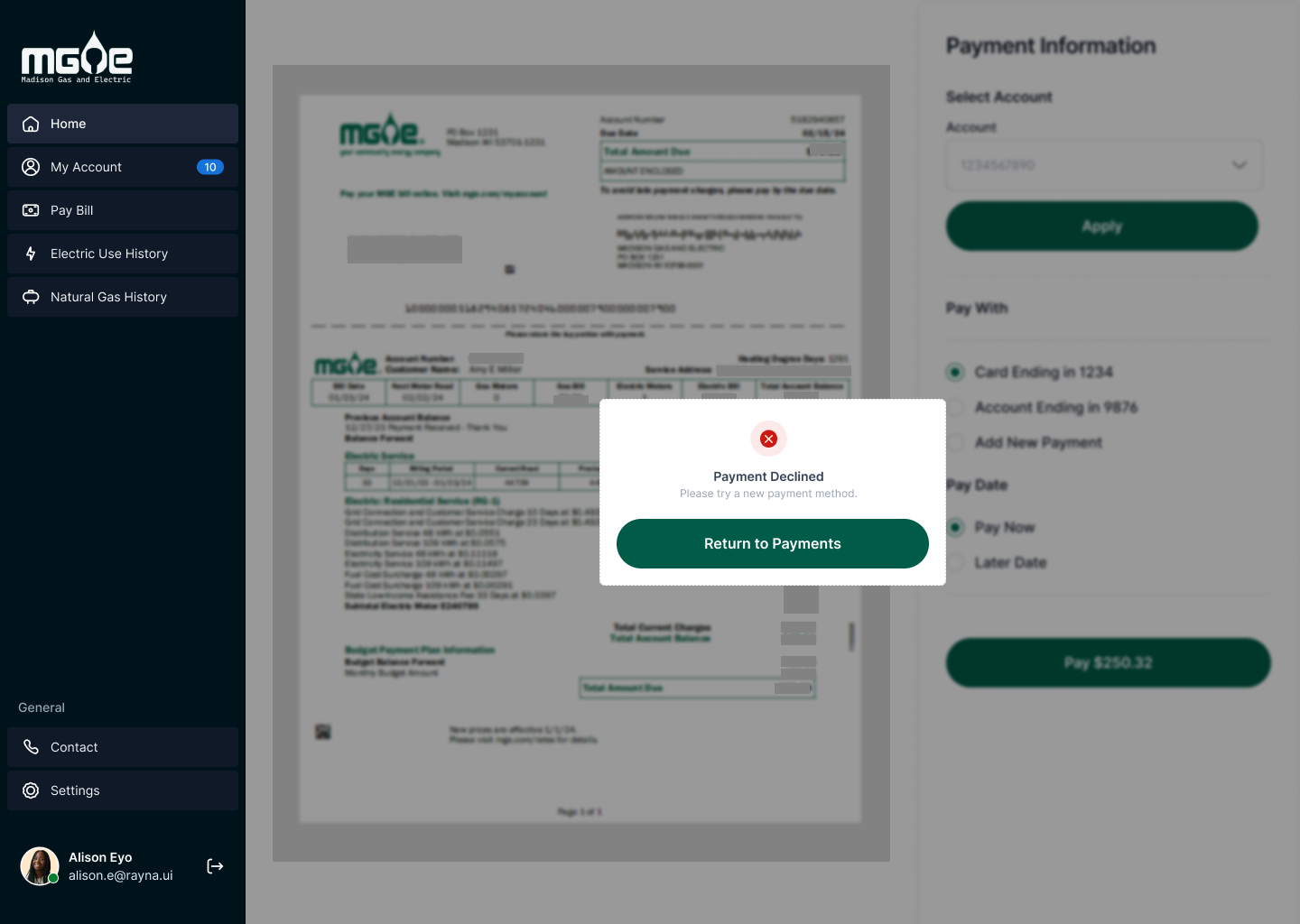

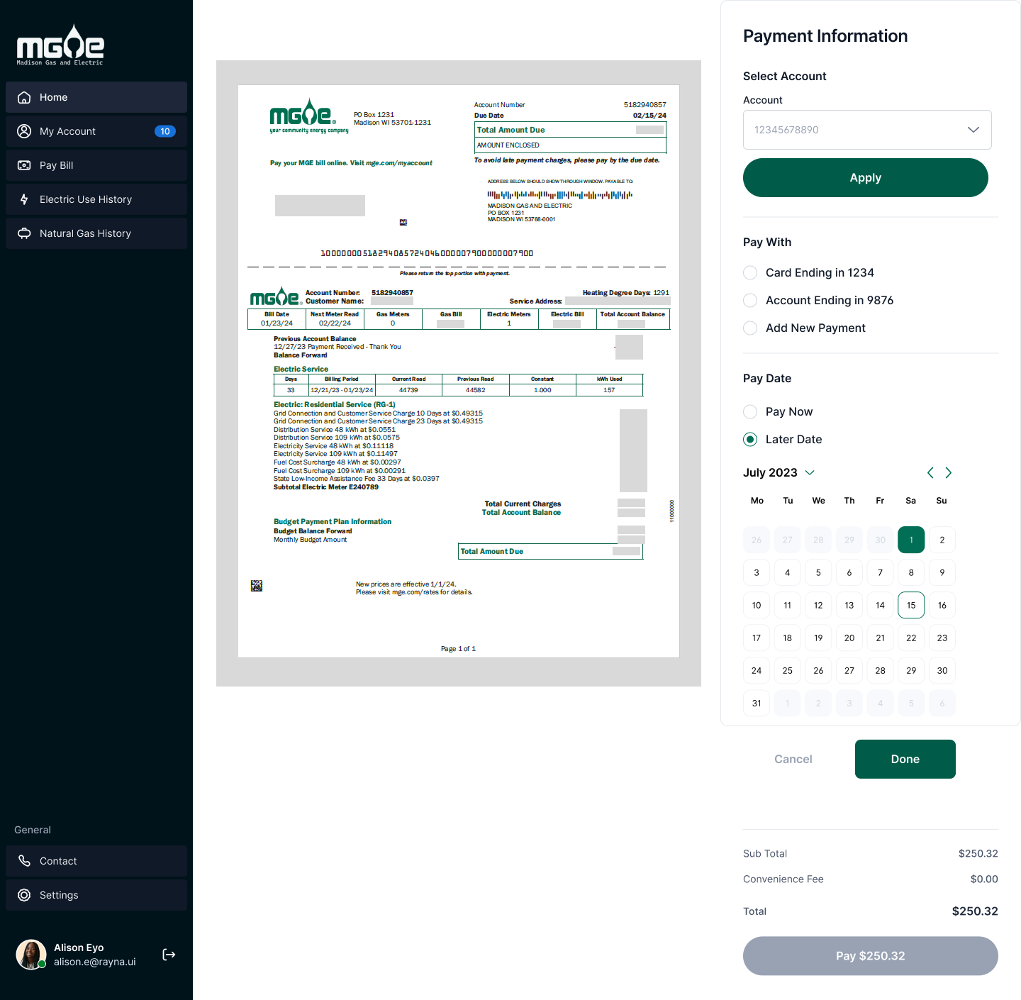
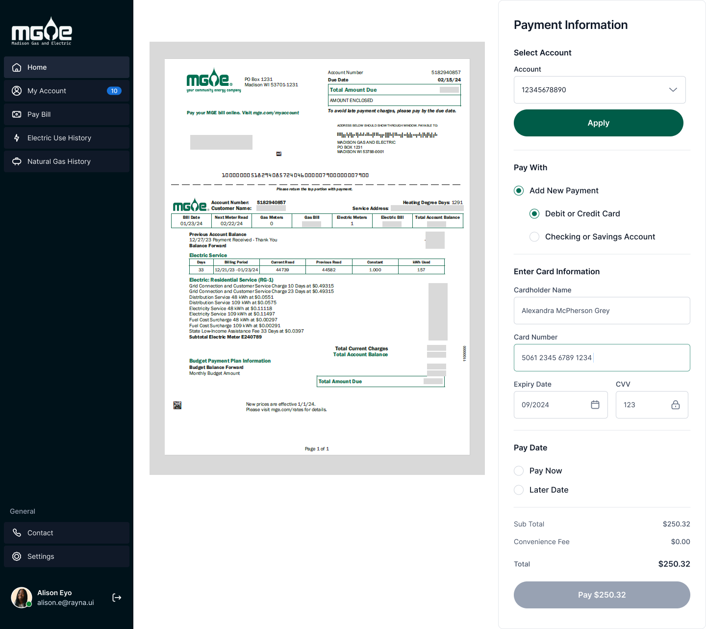
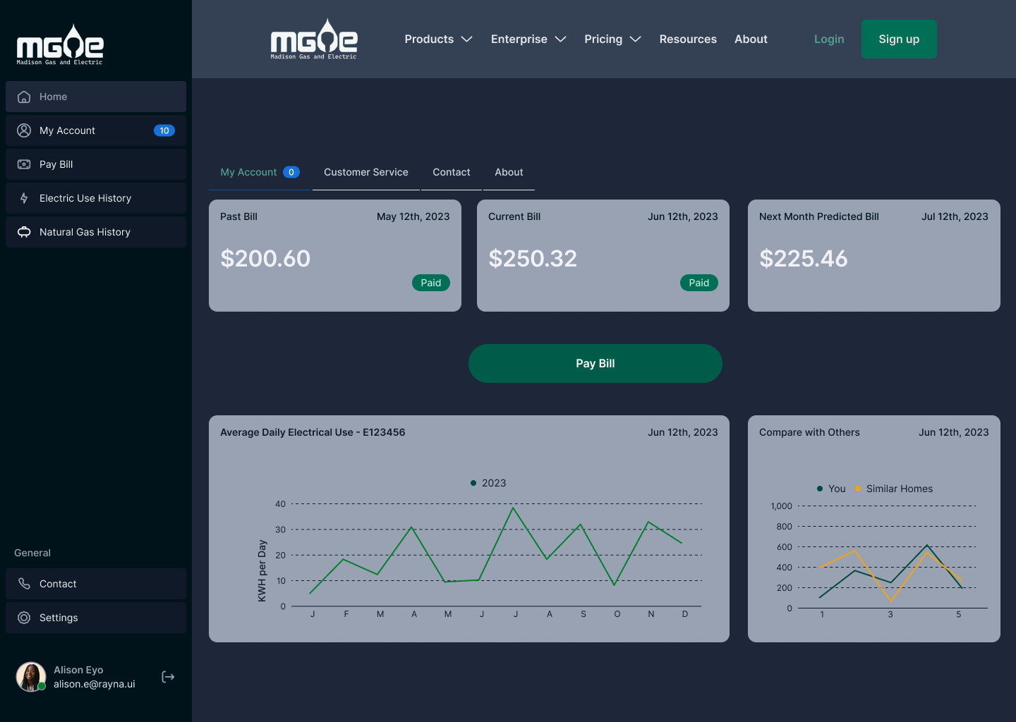
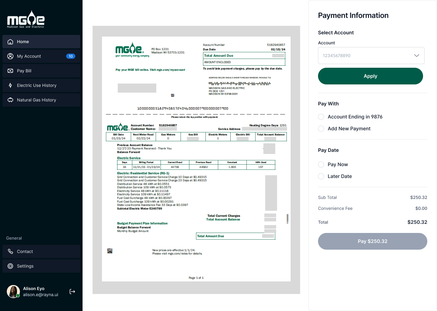
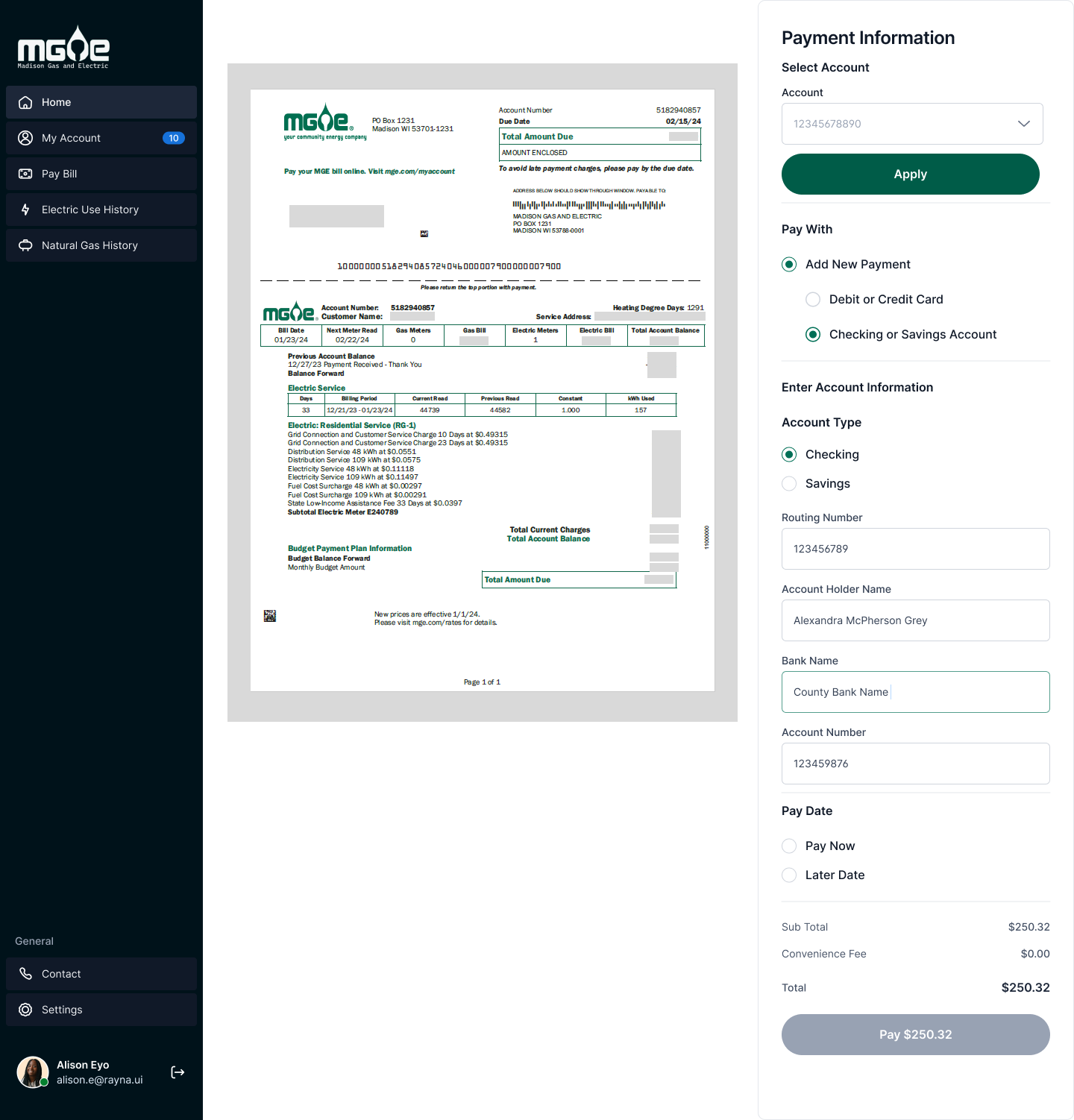
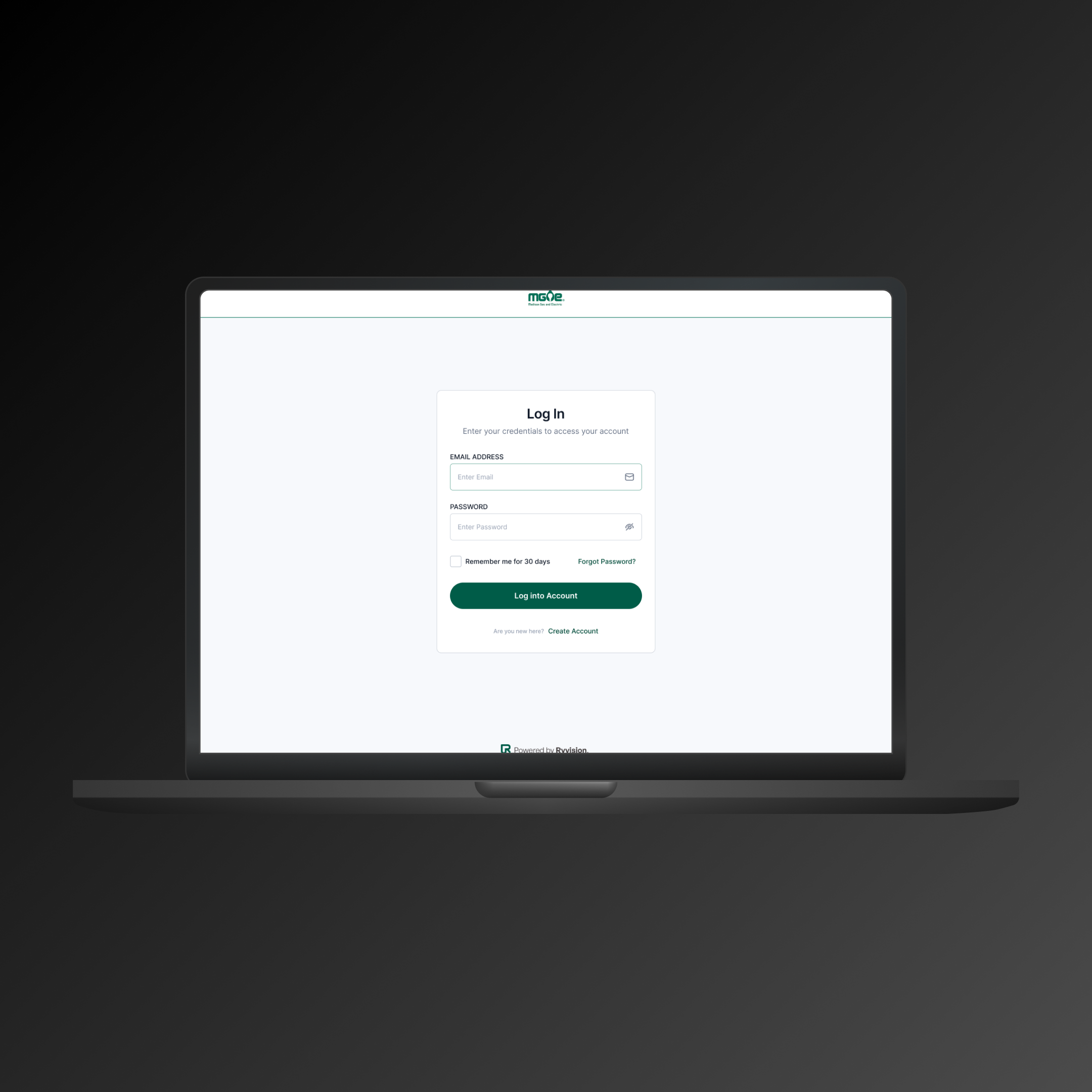
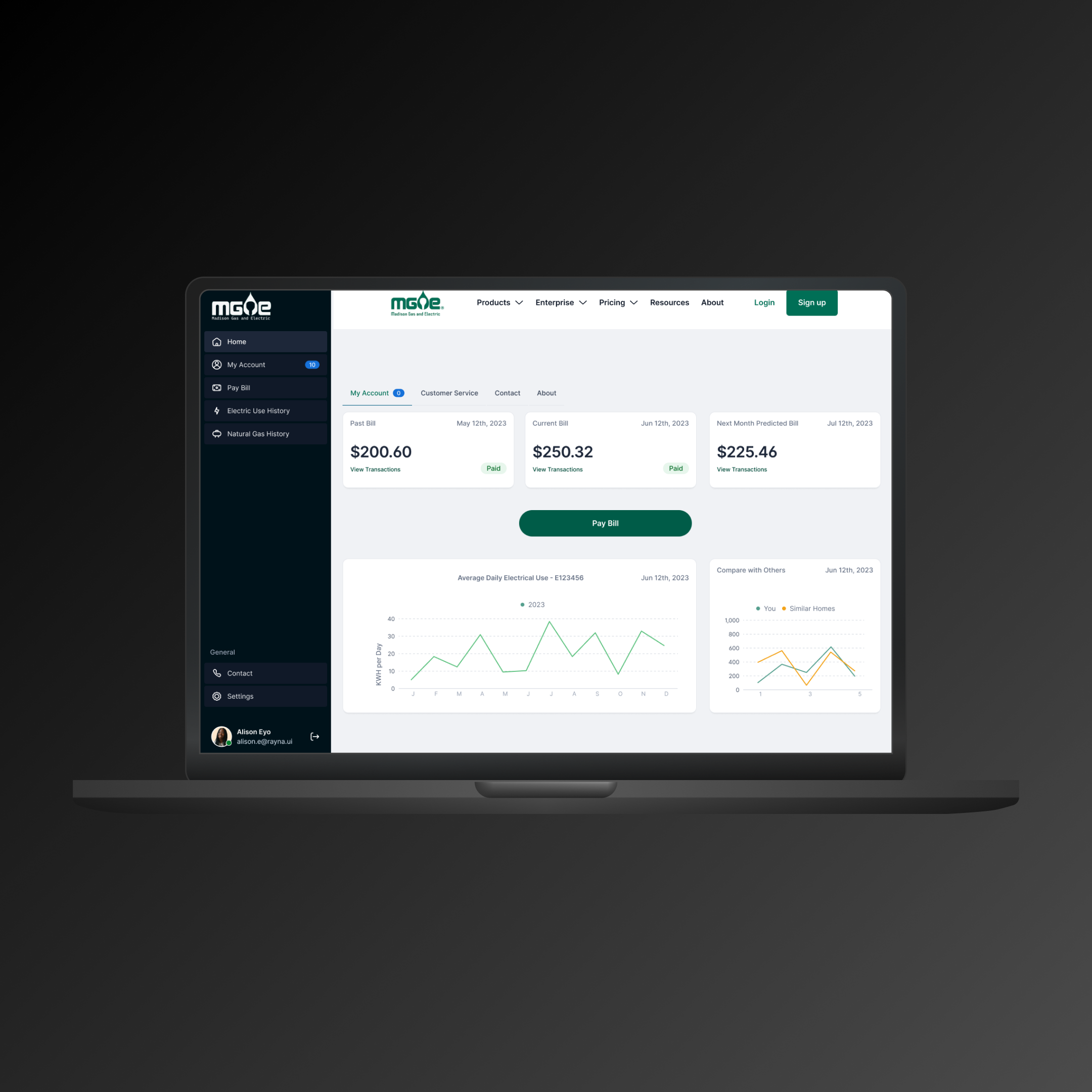
MOCKUP DESIGNS
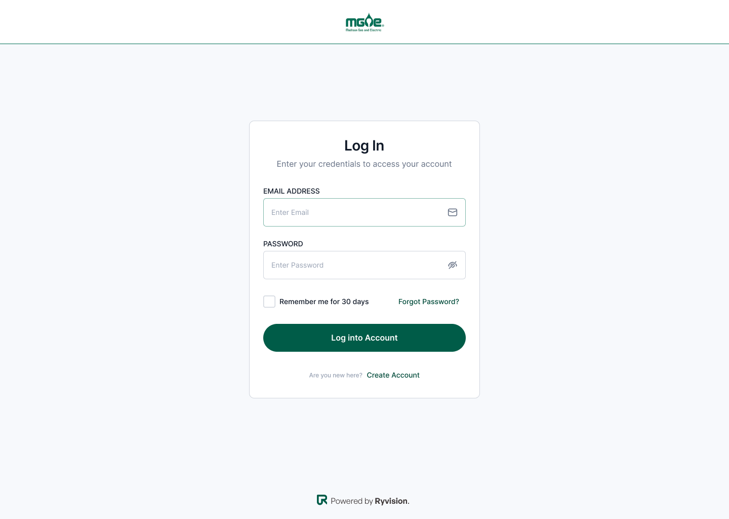
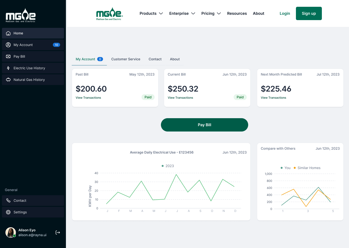
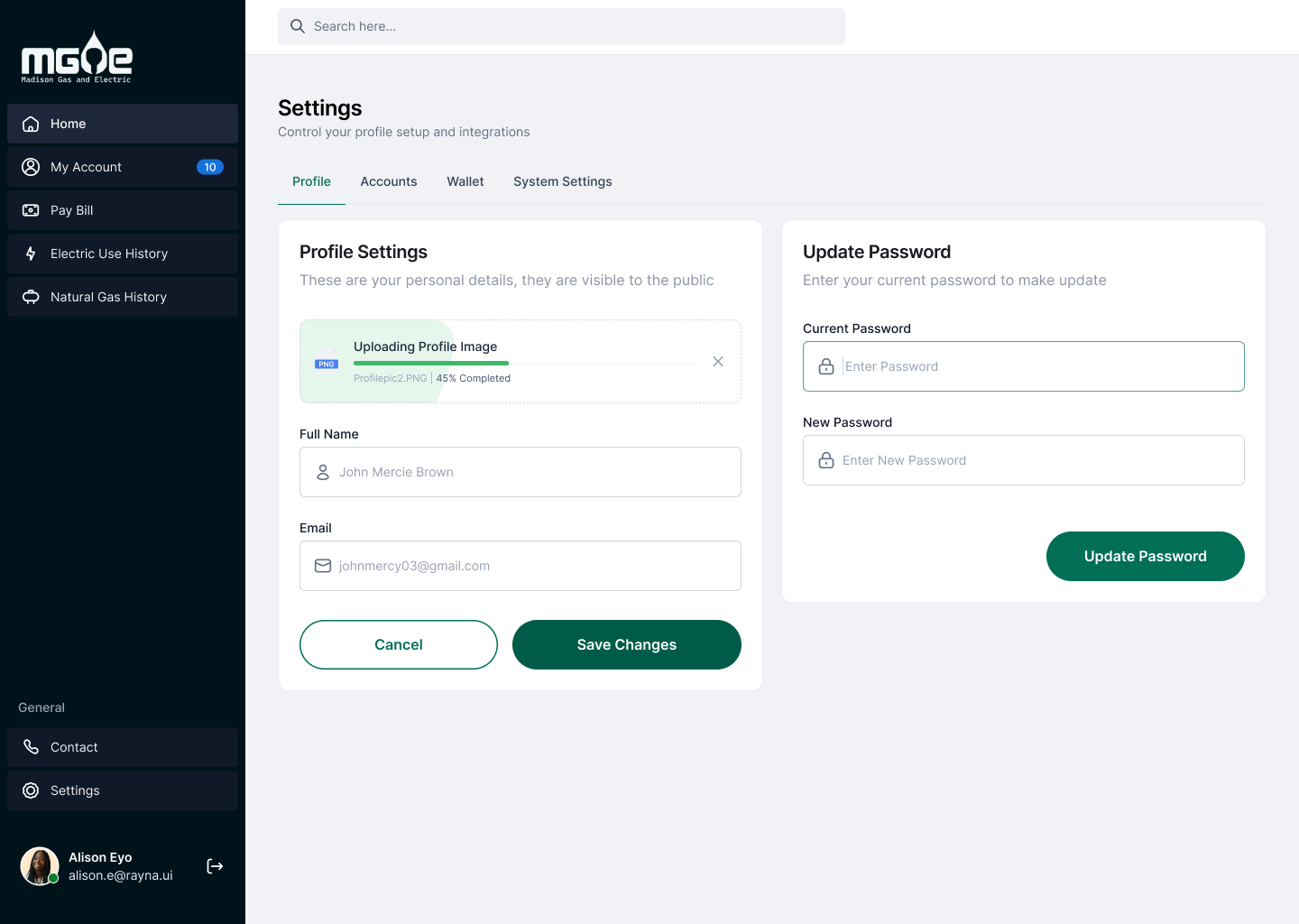
The redesign was made with preset assets from Rayna UI, a comprehensive component library system with over 500 customizable components, templates, and UI styles designed to help create prototypes quickly and effectively. The ability to use component libraries is essential to know in UX and UI design, as it is crucial to create cohesive ideas without running the risk of inconsistency.
